Last week we discussed the first part of working with text components and left some big tasks for this week. This week we’ll try to address the remaining issues with text input and make it easier to construct UI’s. This is crucial as we’ll be going into code freeze soon and we need enough time to iron out the issues in the text input.
Last week I ended the post with this set of tasks:
-
The floating hint API is bad – we will need a new API to represent text field and label together both for iOS and Android
-
We will need a solution for the special case characters or icons that remain when typing and aren’t there as a hint. There are several tricks we can do but I need to give this some thought especially how they will work with something like a floating hint
-
We need to handle error messages in a standard way
All of these can be solved by adding a new component type that will replace the problematic FloatingHint hack. One of the mistakes we made with Codename One was following the conventions of Swing where the label and component are separate. However, this isn’t really the case and theming can have a deep impact on this. E.g. the label on Android should be above the text field and float into place while the label in iOS should be next to it.
This means we need a new API that will encapsulate the text component and the label next to it. This new API should be consistent, elegant and most importantly: “seamless”…
TextComponent & TextModeLayout
Let’s start with the end of last weeks post:
Back then I wrote that using the FloatingHint as such:
TableLayout tl = new TableLayout(3, 2);
Form f = new Form("Pixel Perfect", tl);

TextField title = new TextField("", "Title");
TextField price = new TextField("", "Price");
TextField location = new TextField("", "Location");
TextArea description = new TextArea("");
description.setHint("Description");

f.add(tl.createConstraint().horizontalSpan(2), new FloatingHint(title));
f.add(tl.createConstraint().widthPercentage(30), new FloatingHint(price));
f.add(tl.createConstraint().widthPercentage(70), new FloatingHint(location));
f.add(tl.createConstraint().horizontalSpan(2), new FloatingHint(description));

f.show();
Besides being verbose this looked bad on iOS:
So we need something better… This code produces the exact same look on Android (more on that soon) but it does that while producing a good looking result on iOS too:
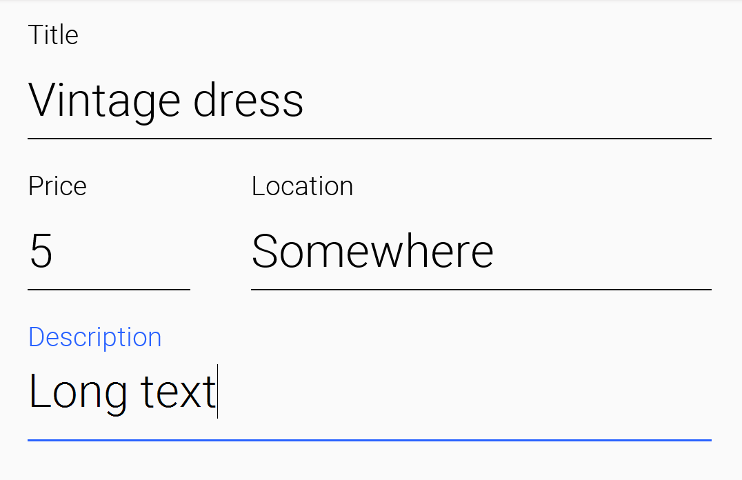
TextModeLayout tl = new TextModeLayout(3, 2);
Form f = new Form("Pixel Perfect", tl);

TextComponent title = new TextComponent().label("Title");
TextComponent price = new TextComponent().label("Price");
TextComponent location = new TextComponent().label("Location");
TextComponent description = new TextComponent().label("Description").multiline(true);

f.add(tl.createConstraint().horizontalSpan(2), title);
f.add(tl.createConstraint().widthPercentage(30), price);
f.add(tl.createConstraint().widthPercentage(70), location);
f.add(tl.createConstraint().horizontalSpan(2), description);
f.setEditOnShow(title.getField());

f.show();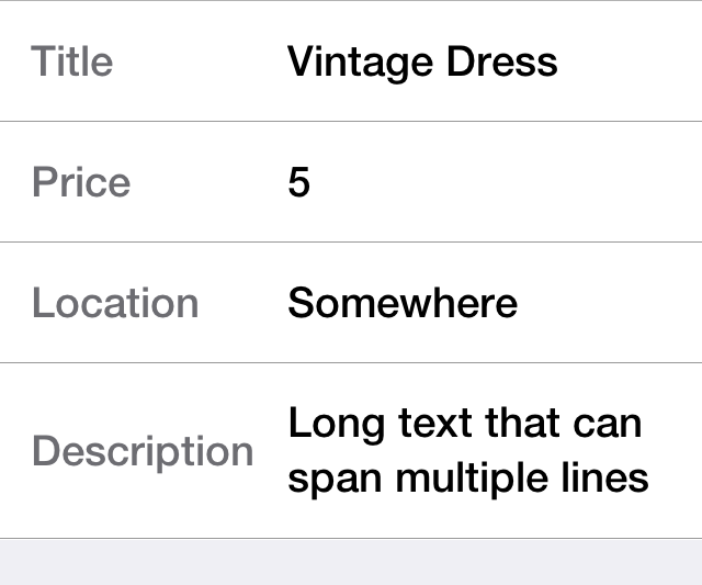
Why a New Layout?
As you can see from the code and samples above there is a lot going on under the hood. On Android we want a layout that’s similar to TableLayout so we can “pack” the entries. On iOS we want a box layout Y type of layout but we also want the labels/text to align properly…
The new TextModeLayout isn’t really a layout as much as it is a delegate. When running in the Android mode (which we refer to as the “on top” mode) the layout is almost an exact synonym of TableLayout and in fact delegates to an underlying table layout. In fact there is a public final table instance within the layout that you “can” refer to directly…
There is one small difference between the TextModeLayout and the underlying TableLayout and that’s our choice to default to align entries to TOP with this mode. It’s important for error handling which I’ll cover below.
When working in the non-android environment we use a BoxLayout on the Y axis as the basis. There is one thing we do here that’s different from a default box layout and that’s grouping. Grouping allows the labels to align by setting them to the same width, internally it just invokes Component.setSameWidth(). Since text components hide the labels there is a special group method there that can be used. However, this is implicit with the TextModeLayout which is pretty cool.
TextComponent
The text component uses a builder approach to set various values e.g.:
TextComponent t = new TextComponent().
    text("This appears in the text field").
    hint("This is the hint").
    label("This is the label").
    multiline(true);
I think the code is pretty self explanatory and more convenient than typical setters/getters. It automatically handles the floating hint style of animation but does that more smoothly using layout & style animation instead of the outdated morph animation.
We also added some pretty spiffy new features to address the points above…
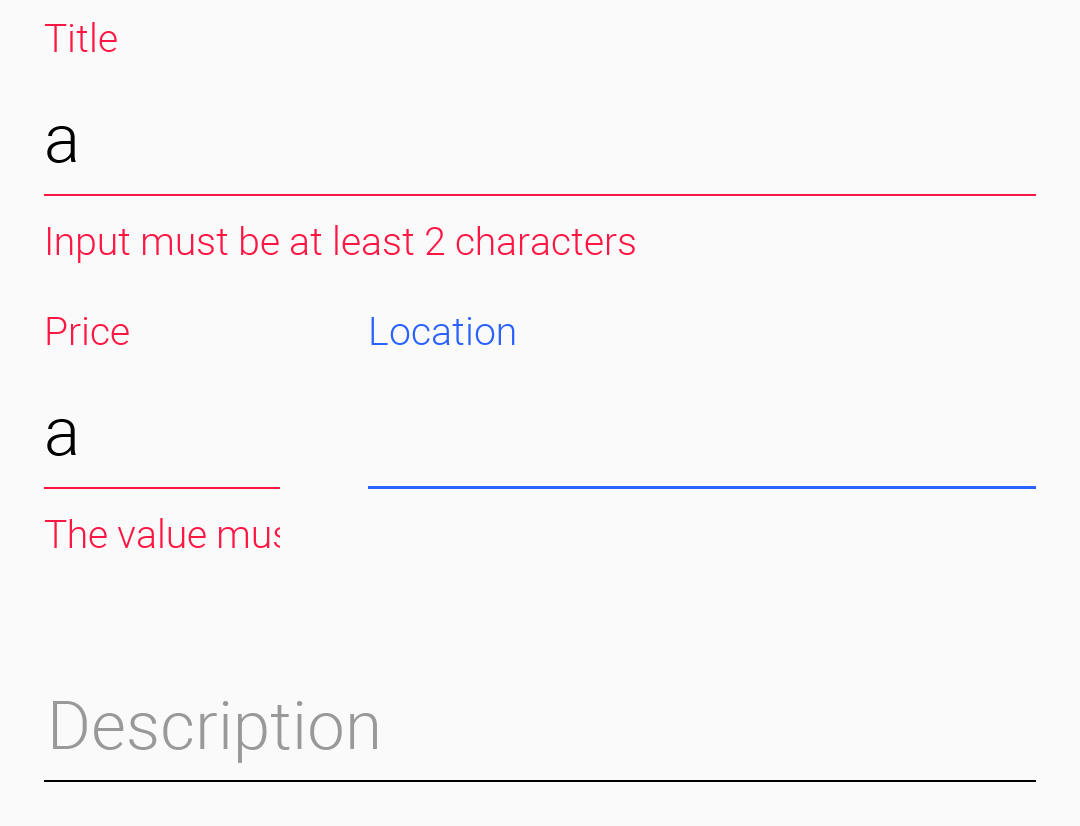
Error Handling
I’ve added support to the validator class for text component and it should “just work”. But the cool thing is that it uses the material design convention for error handling!
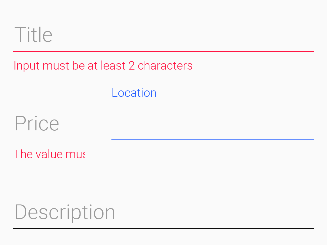
So if we change the sample above to use the validator class:
TextModeLayout tl = new TextModeLayout(3, 2);
Form f = new Form("Pixel Perfect", tl);

TextComponent title = new TextComponent().label("Title");
TextComponent price = new TextComponent().label("Price");
TextComponent location = new TextComponent().label("Location");
TextComponent description = new TextComponent().label("Description").multiline(true);

Validator val = new Validator();
val.addConstraint(title, new LengthConstraint(2));
val.addConstraint(price, new NumericConstraint(true));

f.add(tl.createConstraint().horizontalSpan(2), title);
f.add(tl.createConstraint().widthPercentage(30), price);
f.add(tl.createConstraint().widthPercentage(70), location);
f.add(tl.createConstraint().horizontalSpan(2), description);
f.setEditOnShow(title.getField());

f.show();
You would see something that looks like this on Android:
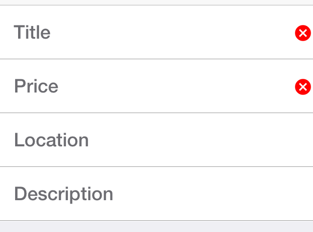
The underlying system is the errorMessage method which you can chain like the other methods on TextComponent as such:
TextComponent tc = new TextComponent().
    label("Input Required").
    errorMessage("Input is essential in this field");
InputComponent & PickerComponent
To keep things simple I focused on the the TextComponent but after the initial commit we decided to move to a more flexible system where other component types could be laid out in a similar way to maintain consistency with Android/iOS.
To keep the code common and generic we use the InputComponent abstract base class and derive the other classes from that. PickerComponent is currently the only other option. We considered options such as CheckBox or OnOffSwitch but both are problematic in some ways so we’d like to give them a bit more thought.
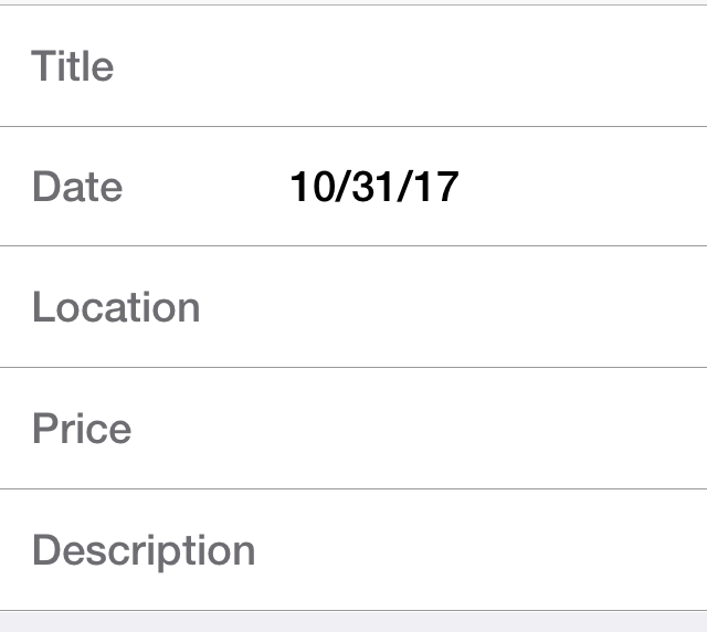
A picker can work with our existing sample using code like this:
TextModeLayout tl = new TextModeLayout(3, 2);
Form f = new Form("Pixel Perfect", tl);

TextComponent title = new TextComponent().label("Title");
TextComponent price = new TextComponent().label("Price");
TextComponent location = new TextComponent().label("Location");
PickerComponent date = PickerComponent.createDate(new Date()).label("Date");
TextComponent description = new TextComponent().label("Description").multiline(true);

Validator val = new Validator();
val.addConstraint(title, new LengthConstraint(2));
val.addConstraint(price, new NumericConstraint(true));

f.add(tl.createConstraint().widthPercentage(60), title);
f.add(tl.createConstraint().widthPercentage(40), date);
f.add(location);
f.add(price);
f.add(tl.createConstraint().horizontalSpan(2), description);
f.setEditOnShow(title.getField());

f.show();
This produces the following which looks pretty standard:
As I mentioned this is pretty obvious once we got through everything else. The one tiny caveat is that we don’t construct the picker component using new PickerComponent() instead we use create methods such as PickerComponent.createDate(new Date()). The reason for that is that we have many types of pickers and it wouldn’t make sense to have one constructor.
Underlying Theme Constants
These varying looks are implemented via a combination of layouts, theme constants and UIID’s. The most important UIID’s are: TextComponent, FloatingHint & TextHint.
There are several theme constants related that can manipulate some pieces of this functionality:
-
textComponentErrorColora hex RGB color which defaults to null in which case this has no effect. When defined this will change the color of the border and label to the given color to match the material design styling. This implements the red border underline in cases of error and the label text color change -
textComponentOnTopBooltoggles the on top mode which makes things look like they do on Android. This defaults to true on Android and false on other OS’s. This can also be manipulated via theonTopMode(boolean)method inInputComponenthowever the layout will only use the theme constant -
textComponentAnimBooltoggles the animation mode which again can be manipulated by a method inInputComponent. If you want to keep the UI static without the floating hint effect set this to false. Notice this defaults to true only on Android -
textComponentFieldUIIDsets the UIID of the text field to something other thanTextFieldthis is useful for platforms such as iOS where the look of the text field is different within the text component. This allows us to make the background of the text field transparent when it’s within theTextComponentand make it different from the regular text field
Final Word
We went through a lot to get to this point but there is quite a bit more that we need to address:
-
Other component types – we need better support for things such as on-off switches etc.
-
We didn’t implement the material design feature of icon or symbol on the side of a text field, it’s something we might want to address in a future update. I’m not sure how this will play nicely with the animation
-
There are some cool features and iOS refinements we’d like to add, e.g. on iOS icons are common next to the labels and error handling there should be better
-
The properties instant UI code should migrate to this as soon as possible, right now it’s not practical since we don’t have checkbox/on-off support but once those are in place this is something we should support
Overall I hope the work speaks for itself and that soon we’ll be able to say that our UI matches and hopefully exceeds the refinement of OS native code.
