Table is a composite component
(but it isn’t a lead component),
this means it is a subclass of Container.
It’s effectively built from multiple components.
__ | Table is heavily based on the
TableLayout class. It’s important
to be familiar with that layout manager when working with Table. |
|---|
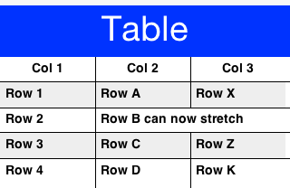
Here is a trivial sample of using the standard table component:
Form hi = new Form("Table", new BorderLayout());
TableModel model = new DefaultTableModel(new String[] {"Col 1", "Col 2", "Col 3"}, new Object[][] {
    {"Row 1", "Row A", "Row X"},
    {"Row 2", "Row B", "Row Y"},
    {"Row 3", "Row C", "Row Z"},
    {"Row 4", "Row D", "Row K"},
    }) {
        public boolean isCellEditable(int row, int col) {
            return col != 0;
        }
    };
Table table = new Table(model);
hi.add(BorderLayout.CENTER, table);
hi.show();
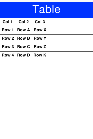
Figure 1. Simple Table usage
| __ | In the sample above the title area and first column aren’t editable. The other two columns are editable. |
|---|
The more “interesting” aspects of the Table class can be achieved via the TableLayout. You can use the layout constraints (also exposed in the table class) to create spanning and elaborate UI’s.
E.g.:
Form hi = new Form("Table", new BorderLayout());
TableModel model = new DefaultTableModel(new String[] {"Col 1", "Col 2", "Col 3"}, new Object[][] {
    {"Row 1", "Row A", "Row X"},
    {"Row 2", "Row B can now stretch", null},
    {"Row 3", "Row C", "Row Z"},
    {"Row 4", "Row D", "Row K"},
    }) {
        public boolean isCellEditable(int row, int col) {
            return col != 0;
        }
    };
Table table = new Table(model) {
    @Override
    protected TableLayout.Constraint createCellConstraint(Object value, int row, int column) {
        TableLayout.Constraint con =  super.createCellConstraint(value, row, column);
        if(row == 1 && column == 1) {
            con.setHorizontalSpan(2);
        }
        con.setWidthPercentage(33);
        return con;
    }
};
hi.add(BorderLayout.CENTER, table);
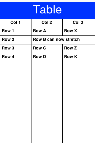
Figure 2. Table with spanning & fixed widths to 33%
In order to customize the table cell behavior you can derive the Table to create a “renderer like” widget, however unlike the list this component is “kept” and used as is. This means you can bind listeners to this component and work with it as you would with any other component in Codename One.
So let’s fix the example above to include far more capabilities:
Table table = new Table(model) {
    @Override
    protected Component createCell(Object value, int row, int column, boolean editable) { __**(1)**
        Component cell;
        if(row == 1 && column == 1) {  __**(2)**
            Picker p = new Picker();
            p.setType(Display.PICKER_TYPE_STRINGS);
            p.setStrings("Row B can now stretch", "This is a good value", "So Is This", "Better than text field");
            p.setSelectedString((String)value);  __**(3)**
            p.setUIID("TableCell");
            p.addActionListener((e) -> getModel().setValueAt(row, column, p.getSelectedString()));  __**(4)**
            cell = p;
        } else {
            cell = super.createCell(value, row, column, editable);
        }
        if(row > -1 && row % 2 == 0) {  __**(5)**
            // pinstripe effect
            cell.getAllStyles().setBgColor(0xeeeeee);
            cell.getAllStyles().setBgTransparency(255);
        }
        return cell;
    }

    @Override
    protected TableLayout.Constraint createCellConstraint(Object value, int row, int column) {
        TableLayout.Constraint con =  super.createCellConstraint(value, row, column);
        if(row == 1 && column == 1) {
            con.setHorizontalSpan(2);
        }
        con.setWidthPercentage(33);
        return con;
    }
};
| __1 | The createCell method is invoked once per component but is similar conceptually to the List renderer. Notice that it doesn’t return a “rubber stamp” though, it returns a full component. |
|---|---|
| __2 | We only apply the picker to one cell for simplicity’s sake. |
| __3 | We need to set the value of the component manually, this is crucial since the Table doesn’t “see” this. |
| __4 | We need to track the event and update the model in this case as the Table isn’t aware of the data change. |
| __5 | We set the “pinstripe” effect by coloring even rows. Notice that unlike renderers we only need to apply the coloring once as the Components are stateful. |
Figure 3. Table with customized cells using the pinstripe effect
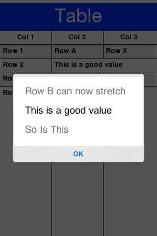
Figure 4. Picker table cell during edit
Archived Comments
This post was automatically migrated from the legacy Codename One blog. The original comments are preserved below for historical context. New discussion happens in the Discussion section.
Tommy Mogaka — February 14, 2016 at 5:03 am (permalink)
In the case that cell contents are too long, is it possible to stretch the cell vertically by wordwraping its contents so that they don’t truncate out or push the content of the cell next to it out of view?
Thanks for the update on tables…. this is the one UI item many are long awaiting!
On the work on the documentation, a thumbs up! It will go a long way to making CN1 easily adopted by more developers.
Shai Almog — February 15, 2016 at 3:24 am (permalink)
Thanks, that’s a great headsup on something that we missed in the table docs!
We added that into the developer guide and you’ll see an additional section talking about line wrapping and its pitfalls in the coming update of the guide later today.
Discussion
Join the conversation via GitHub Discussions.