![]()
One of the big issues with some new users who picked up Codename One was the lack of up to date device skins. We made several attempts in the past to improve this situation but these ended up as half measures at best. Last week we addressed some of the core problems that made it hard to add new skins and as a result we now have 33 new skins that are far better than anything we had before.
Specifically:
-
GooglePixel
-
GooglePixel2
-
GooglePixel2XL
-
HTCOneA9
-
HTCOneM8
-
HuaweiP8
-
MicrosoftLumia950
-
MotoE
-
MotoG
-
Nexus4
-
Nexus5X
-
Nexus6P
-
SamsungGalaxyGrandPrime
-
SamsungGalaxyNote5
-
SamsungGalaxyS3
-
SamsungGalaxyS5
-
SamsungGalaxyS7
-
SamsungGalaxyS8
-
iPhone5c
-
iPhone5s
-
iPhone6s
-
iPhone6sPlus
-
iPhone7
-
iPhone7Plus
-
iPhone8
-
iPhone8Plus
-
iPhoneX
-
MicrosoftSurface3
-
MicrosoftSurfacePro4
-
Nexus9
-
iPadAir2
-
iPadMini4
-
iPadPro
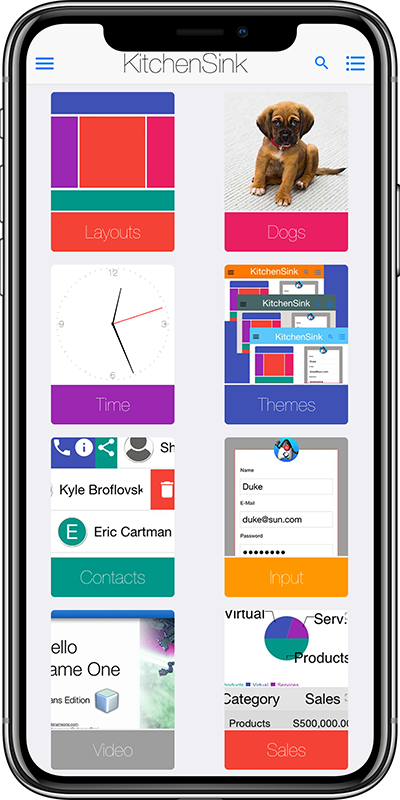
You will notice some pretty cool skins in that list and unlike before we got a lot of things right. As part of this update we also added the ability to take a screenshot with the skin which looks pretty cool…
You will also notice in this list of skins the Google Pixel XL 2 and iPhone X. These skins show a non-rectangular portion of the screen which was previously problematic.

Why did it Take so Long?
Besides the obvious amount of work we needed to do to get here there were also several problems we had to resolve.
The most obvious one was a good source for skin images. This is important as a lot of mockups on the Internet get some things wrong e.g. pixels off in the area of the screen etc. Once that was in place we made a few changes that made the whole process of skinning far easier.
Status Bar
When we launched Codename One all operating systems had a status bar on the top of the display. This doesn’t sound like a big deal but it was a HUGE pain. It was technically part of the screen but separate because you could take a screenshot with or without the status bar for different use cases.
However, in recent years modern phone UI views the status bar as part of the applications screen real-estate and so it no longer makes sense to have it in the skin. So the new skins ignore that aspect. This keeps them more consistent with the way modern phone OS’s behave.
PPI – Pixels Per Inch
Up until now when you defined a skin file you had to provide a numeric value that indicated the ratio of pixels per millimeter. It wasn’t hard to calculate that value but it was tedious and unintuitive…
However, almost every device has a well known PPI value that represents its density. Calculating the pixel ratio from the PPI value is pretty easy. So you can now use the ppi key when defining a new skin like I did here in the iPhone X skin properties.
Oddly Shaped Skins
The iPhone X skin isn’t just rounded. It has a notch on top that hides a portion of the UI. The Pixel 2 XL skin also includes rounded corners which also obstruct a portion of the screen. That was very challenging.
These skins required a fix to some paint bugs that triggered flickering. But they also needed a bigger conceptual fix.
Up until now we just used a system that marked the area of the screen using black pixels. That worked well and removed the need to measure pixels accurately. However, this wouldn’t work with an oddly shaped screen as the API wouldn’t know how to answer getDisplayHeight() for an iPhone X device. We toyed briefly with the idea of writing some complex heuristics for calculating that but eventually decided this wasn’t a good idea…
Instead we added the following fields to the skin.properties file:
roundScreen=true
displayWidth=1125
displayHeight=2436
displayX=85
displayY=77
When roundSkin is turned on we check these following variables to pick up the square coordinates of the screen then draw the skin on top of them. Notice that the screen is always square regardless of the shape of the phone.
San Francisco Font
In iOS 9 Apple transitioned from the Helvetica Neue font to the San Francisco font. Both look very similar and I for one can’t tell them apart to save my life. But it’s important to keep up so we decided to switch the font as well.
However, unlike previous iterations of the font Apple made the font names somewhat obtuse and inconsistent. So the only way to load the font is by using low level API’s that fetch the default OS font.
As a result when our native system asks for Helvetica Neue instead of loading that we get the system default font which will be Helvetica Neue on older OS’s and San Francisco on newer OS’s. That also means that font changes in future iOS updates should be reflected automatically from now on.
One caveat is italic which still uses the Helvetica Neue font. The syntax for getting weighted italic fonts was problematic so we left it as it is today.
Hidden Status Bar on Android
One of the reasons I gave for the new skins lack of status bar is the trend OS’s have taken to hide the status bar from view. Since iOS 7 developers were expected to deliver an app that runs under the status bar. Our solution for that was including a bit of default padding on the top of the Form in iOS to push the content down.
Android still has a status bar and most apps still use it, you can customize the colors of the Android status bar using the colors.xml as explained here. However, up until now we didn’t support hidden status bars.
We just introduced the build hint android.hideStatusBar which you can set to true. This will make the status bar seem transparent which will allow a more consistent UX with your iOS version.


