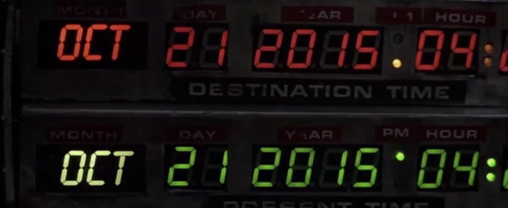
This morning I was awoken by myself – or rather the 1985 version of myself. He (I’ll refer to the 1985 version of myself in the 3rd person here forward) was in a panic and was yammering about something to do with changing history. He asked why my pants were inside out, and I wondered why he was wearing a life preserver. According to him, he had driven a time machine from 1985 to this day (October 21, 2015) in the future to stop me from making a terrible mistake. I asked him: “What mistake?”, to which he produced a 3.5 inch floppy disk.
“On this disk, you’ll find a scan of a single page from a Grays Sports Almanac, that displays the score to the 2015 world series”. He implored me to look at the image and use it to change the team that I had planned to bet on. No sooner did I take the disk from him, than he made like a tree and got out of there.
The first hurdle to viewing this image was in loading it off of that floppy disk in this post floppy disk world. I wasn’t going to let that stop me, though. If you put your mind to it, you can accomplish anything.
After some struggles, I managed to copy the image from the floppy disk onto my cell phone so I could view it. Unfortunately, the image was too small to make anything out. The image itself, he had said was 1 inch by 1 inch. But on my phone, it only rendered at a measly 8th of an inch. It basically looked like a speck on my screen.
What the??! He said it was 1 inch squared. How will I ever see what is on this image? I soon realized that the problem was that I wasn’t thinking 4th dimensionally: the fourth dimension being density. My 1985 self was using a Macintosh of the time that had a pixel density of approximately 57 pixels per inch. My cell phone, on the other hand was a new iPhone 6+, with a pixel density of about 480 pixels per inch. So his 57×57 pixel image looked fine on his old screen, but was only an eighth of an inch on mine. Heavy! Device displays in the future are too dense to display this image at a reasonable size.
What I needed to do was convert this image to a multi-image so that it would display at the proper size on my device, and all devices. So I imported the image into my Codename One resource file, specifying a source density of “Very Low”. Then created a simple app using the Codename One GUI builder, that displays a single label. The source to display the multi-image roughly as follows (Please excuse the crudity of this model. I didn’t have time to build it to scale or paint it):
System.out.println("I'm your density: "+ Display.getInstance().getDeviceDensity());

Label image = new Label(theme.getImage("AlmanacClipping.png"));
theForm.addComponent(image);
Since the image is a multi-image, the app should display it at the correct “real” size of 1 inch by 1 inch.
After loading the app onto my phone, I can finally see the message: “Chicago Cubs win the World Series!”.

Hmm. Good thing I didn’t bet on the Blue Jays, as I had planned to do. On the bright side, my app works. It displays the image in the correct size on all devices. I finally invent something that works! Perhaps I should submit this to the iTunes store and Google Play.
But what if I send in the app in and they don’t like it? What if they say I’m no good? What if they say, “Get out of here kid. You’ve got no future”? I mean, I just don’t think I can take that kind of rejection.
Behind the Scenes: The Making of this Post
The iPhone 3gs has a 3.5″ display with a resolution of 320×480, which works out to approximately 163 pixels per inch across both the horizontal and vertical axes.
The iPhone 4 also has a 3.5″ display, but the resolution is double: 640×960, which works out to approximately 326 pixels per inch across the horizontal and vertical axes.
Therefore, if you render a 163×163 pixel image on an iPhone 3Gs the result will be approximately 1 inch squared in the real world. The same image rendered on an iPhone 4 would be approximately 0.5 inches squared – or half the size. Similarly font sizes, border thickness, padding, margins, and positions specified in pixels will produce different results on an iPhone 3Gs than on an iPhone 4.
This is just a small sample from a vast sea of different device densities that are available on the market. I use this example to demonstrate one of the inherent challenges in writing cross-platform user interfaces. Luckily, Codename One provides you with the tools you need to work in a multi-device world.
Device Densities
At runtime, you can always find the host device’s approximate pixel density using the Display.getDeviceDensity() method. This will return one of:
|
Constant |
Density |
Example Device |
|
|
~ 88 ppi |
|
|
|
~ 120 ppi |
Android ldpi devices |
|
|
~ 160 ppi |
iPhone 3GS, iPad, Android mdpi devices |
|
|
~ 240 ppi |
Android hdpi devices |
|
|
~ 320 ppi |
iPhone 4, iPad Air 2, Android xhdpi devices |
|
|
~ 540 ppi |
iPhone 6+, Android xxhdpi devices |
|
|
~ 750 ppi |
Android xxxhdpi devices |
|
|
~ 1000 ppi |
|
|
|
~ 1250ppi |
Multi-Images
In 99% of cases, you’ll want images to render at the same “real” size on all devices, rather than their pixel size. Codename One has you covered here with its multi-image support. You can import an image into the resource file, specifying its source density, and it will be embedded at all of the densities that you specify. Then you can obtain a reference to the image using the Resources.getImage() method at runtime, it will give the correct version of the image for the device’s density so that the “real” size of the image will be preserved across all devices.
Use Millimetres, Not Pixels for Dimensions
When configuring your styles, you should almost never use “Pixels” as the unit for padding, margins, font size, and border thickness because the results will be inconsistent on different densities. Instead, you should use millimetres for all non-zero units of measurements.
Fractions of Millimetres
Sometimes millimetres don’t give you enough precision for what you want to do. Currently the resource editor only allows you to specify integer values for most units. However, you can achieve more precise results when working directly in Java. The Display.convertToPixels() method will allow you to convert millimetres (or dips) to pixels. It also only takes an integer input, but you can use it to obtain a multiplier that you can then use to convert any millimeter value you want into pixels.
E.g.
double pixelsPerMM = ((double)Display.getInstance().convertToPixels(10, true)) / 10.0;And now you can set the padding on an element to 1.5mm. E.g.
myButton.getAllStyles().setPaddingUnit(Style.UNIT_TYPE_PIXELS);
int pixels = (int)(1.5 * pixelsPerMM);
myButton.getAllStyles().setPadding(pixels, pixels, pixels, pixels);
Font Sizes
If you’re using system fonts (the default), then you’re limited to only three font sizes: Small, Medium, and Large. These will be converted to an appropriate “real” size on the device. If you need more precision, you can embed a TTF font with your app, then you can specify font size in millimetres (or DIPS). And if you require more precision on the font size than millimetres, you can use the same trick above to obtain a fractional millimetres to pixels conversion, and use the Font.deriveFont() method to generate a font in the exact “real” size that you desire.
