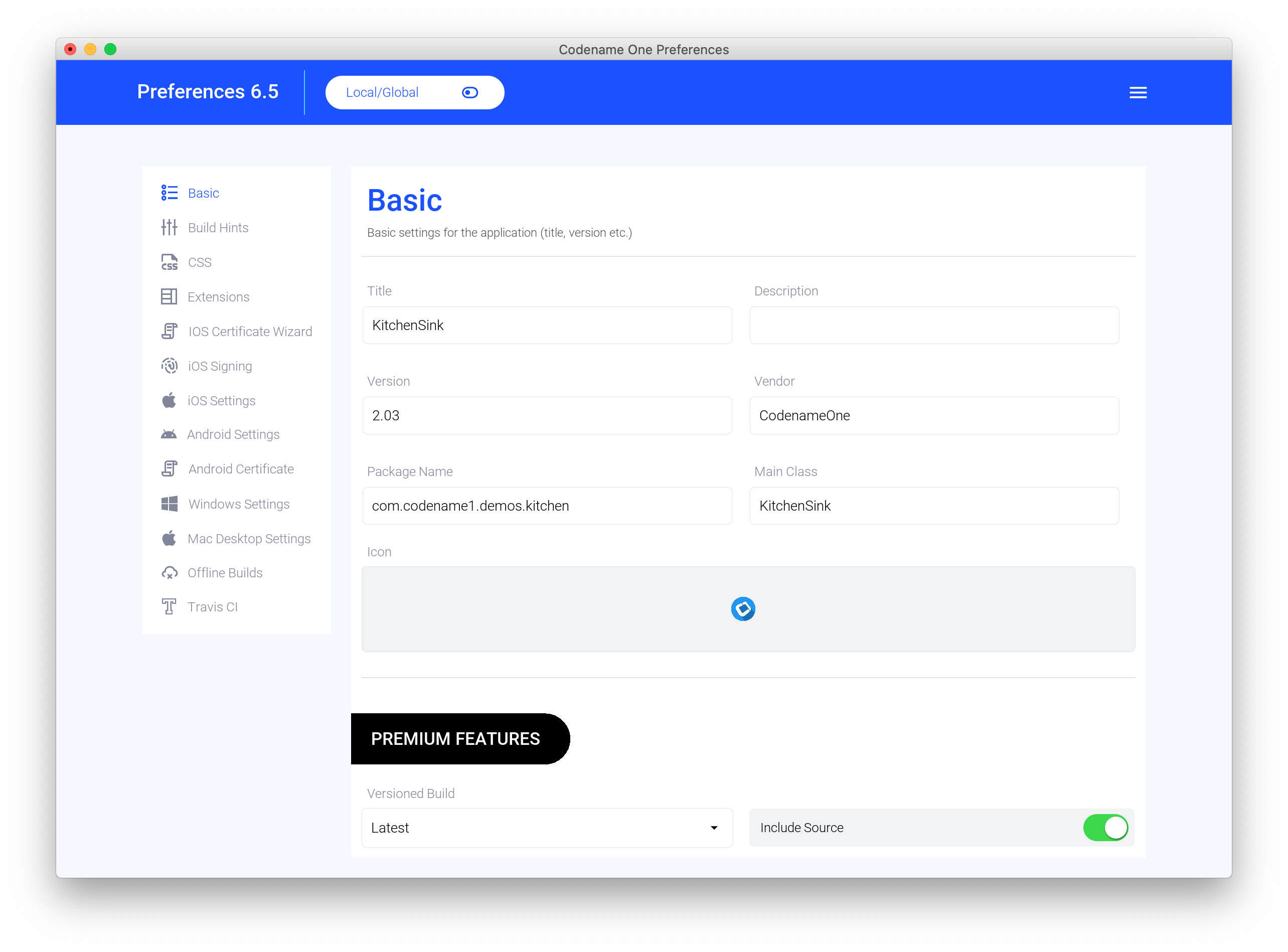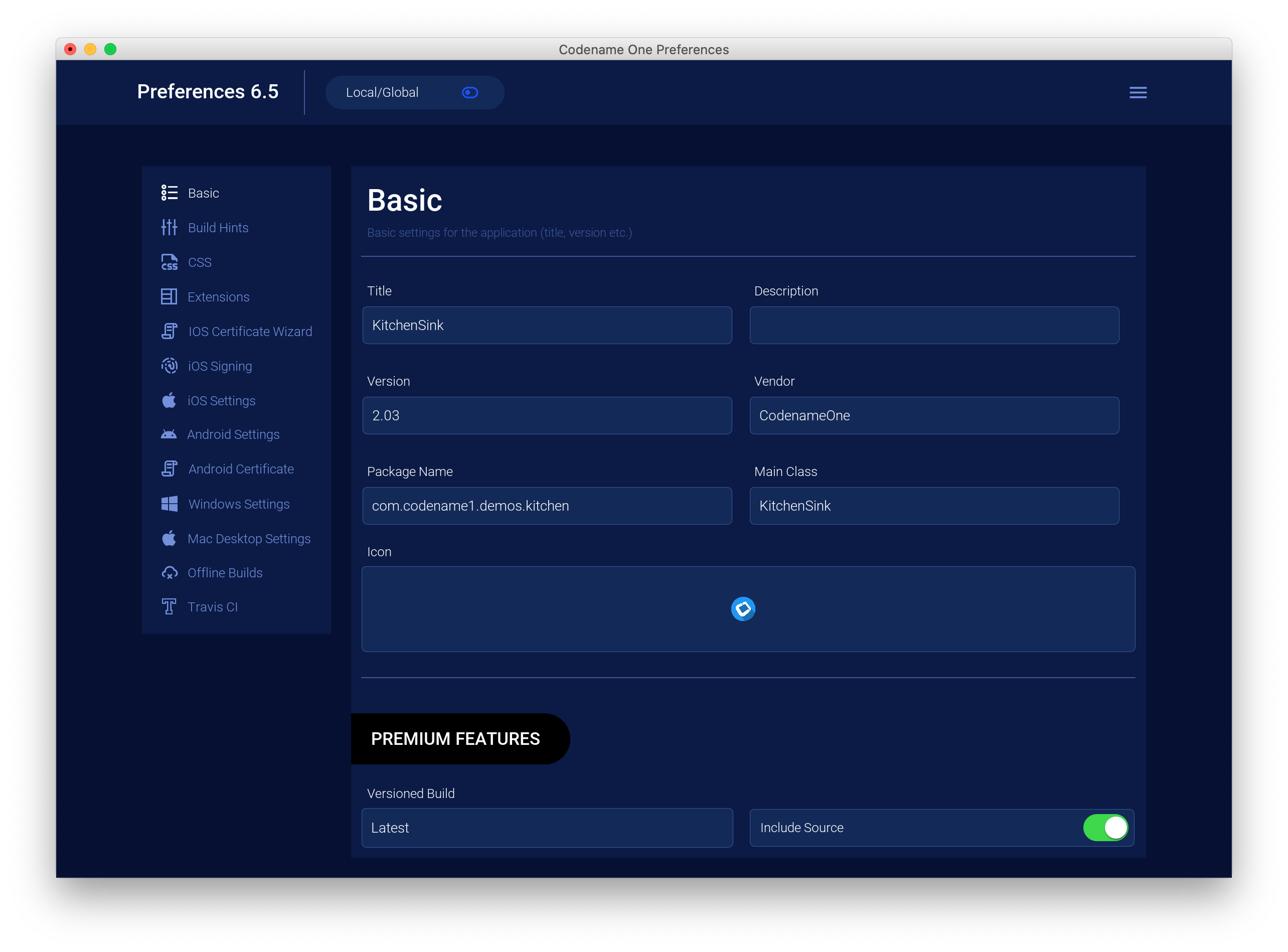
With today’s update we’re releasing a design overhaul for the settings (preferences) application. This overhaul will improve the look and reliability/consistency of this app which is core to Codename One. During this transition period we also have the ability to go back to the legacy UI for 100% compatibility but it will be removed.
Common important features such as “Update Client Libs” are now available in the menu on the top right of the UI. The currently logged in user isn’t listed in the UI only in the about dialog. For most of the UI it doesn’t matter as much since we don’t change as much as we used to. E.g. we now let everyone create a push certificate. This is a pre-cursor to enabling push for everyone with a very low quota for free/basic users.
| This isn’t available yet in the servers and I’m not sure when we’ll have that out |


Focus On Design
This is one of the first signs of very big changes we have coming in the next few months. We intend to overhaul a lot of things in the UI, deep functionalities and even in the free/basic tier features.
The design was made by our new in-house designer Renzo whose work you’ve seen for a while now in our new orignal blog post images. He completely redesigned the website a while back but we’re still having issues in getting it all out there…
He did a lot of great things and I’m confident he’ll help us improve the one part where we sorely lack: good looking by default.
To help him please check out the issues in the issue tracker assigned to him and feel free to provide feedback. Any feedback given during the UI design stage is far more valuable. Later on it’s much harder to revisit/adapt an implementation.
To get started check out and follow these two issues for GUI Builder Redesign and Codenme One Build Redesign. Once the tools incorporate this aesthetic, we’ll bring it to the themes we generate. We plan to overhaul project creation and make it easier to change the pre-existing templates in Codename One in an IDE agnostic way.
I’m pretty excited about that…


2 Comments
Now I notice the “File” menu from which you can change the size of the text, menu we talked about on Github.
My feedback is that the text is too little contrasted: it’s hard for me to read a light grey text on a white background, I would prefer a black text on a white background. I also find dark mode tiring for the eyes.
I hope you can make the text black or at least add an option to it. Thank you
We’ll try to increase contrast here to make it more readable.