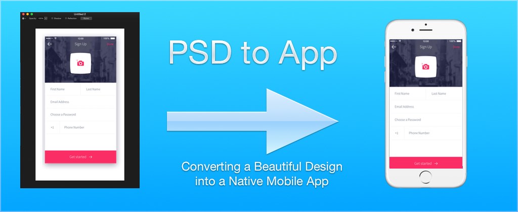
One of our most important posts from 2015 was
Steves PSD to App: Converting a Beautiful Design into a Native Mobile App.
This post included a very thorough step by step video guide walking thru the creation of a non-trivial UI design
and ended with the introduction of Steve’s CSS plugin for Codename One.
As we are close to wrapping up the developer guide update it occurred to us that this remarkably important tutorial
isn’t within the developer guide!
So we re-did the tutorial as a document and while we were doing that we also updated the code a bit to use
the new native fonts (instead of the actual fonts from the PSD). We also updated it to use the new material design
icons which are really appropriate for this design.
This guide is really useful for all developers who deal with UI’s and PSD’s regardless of whether you are a
Codename One developer.
You can check out the full project we discuss below on github here
Converting a PSD To A Theme
Codename One provides extensive support for designing beautiful user interfaces, but it isn’t necessarily obvious to new developers how to achieve their desired results. A common workflow for app design includes a PSD file with mock-ups of the UI, created by a professional designer.
| PSD is the Adobe Photoshop file format, it’s the most common format for UI designs in the industry |
For this tutorial we adapt a very slick looking sign-up form found online and convert it to a Codename One component that can be used inside an application.
The process we followed was:
-
Find the PSD design we want to use:
this PSD file created by Adrian Chiran (we mirrored it here in case it goes offline):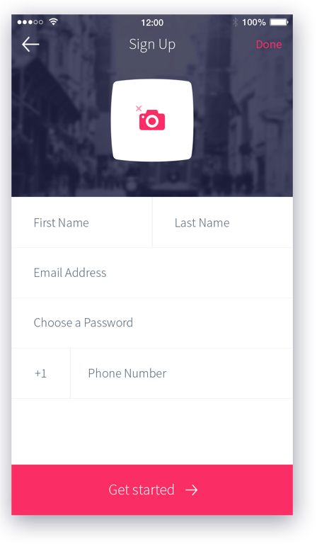 Figure 1. Sign Up form Design
 -
Re-create the general structure and layout of the design in a Codename One
Formusing nested components and layout managers. Here is a break-down of how we structured the component hierarchy in theForm: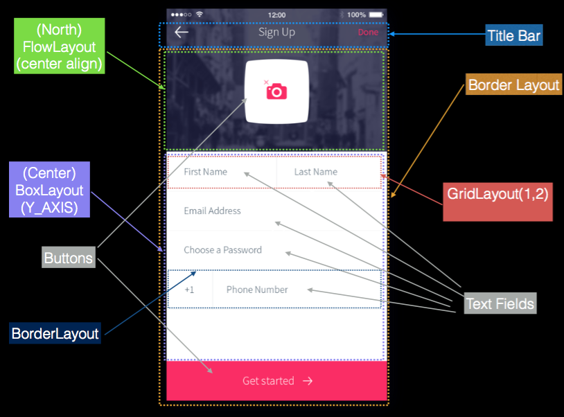 Figure 2. Component hierarchy and layouts
 -
Extract the images we needed using Photoshop – this process is often referred to as “cutting”
-
Extract the fonts, colors, and styles we needed to reproduce the design in Codename One
-
Import images into the Codename one project, and define theme styles so that our components match the look of the original design
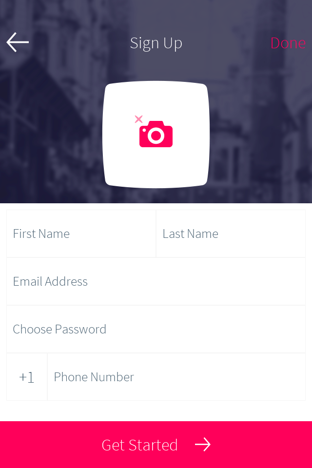
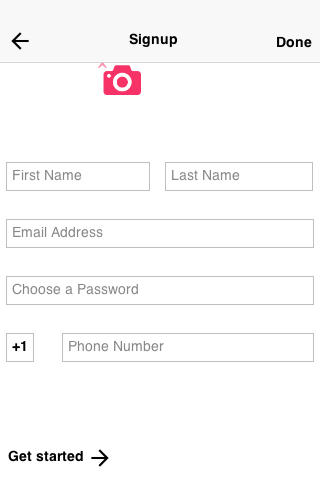
Here is a screenshot of the resulting component running inside the Codename One simulator:
Breaking Down the PSD
Open the PSD you are interested in using Photoshop.
| You might be missing fonts in your system so you can either install them or ignore that. Keep in mind that some fonts might not be redistributable with your application |
In this PSD we want only one of the screen designs so initially we want to remove everything that isn’t related so we can get our bearings more effectively:
-
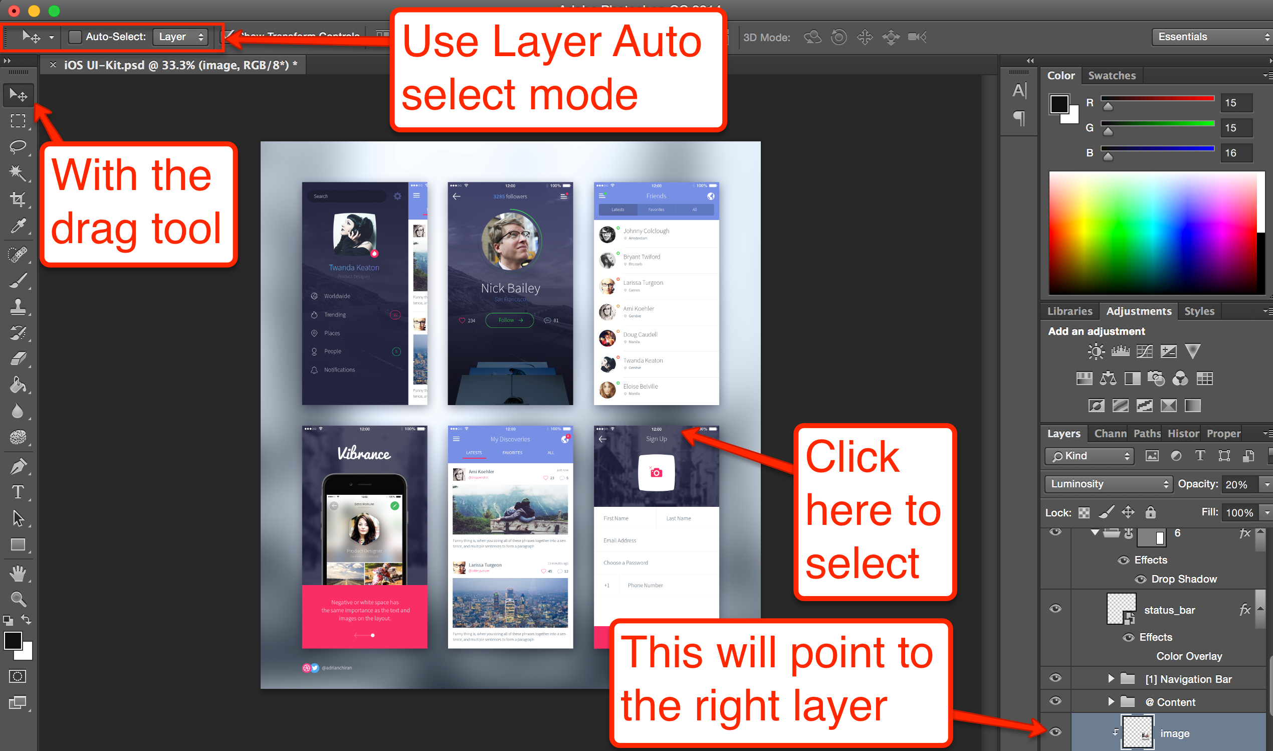
Select the drag tool (the top left tool)
-
In the toolbar for the tool (top bar area) check the Auto Select mode
-
Select the Layer Mode for auto selection (in some cases group would actually be better so feel free to experiment)
-
Click on the portion in the PSD that you are interested in
You should end up with something like this where a layer is selected in the layers window:
Scroll up the hierarchy a bit and uncheck/recheck the eye icon on the left until you locate the right element layer.
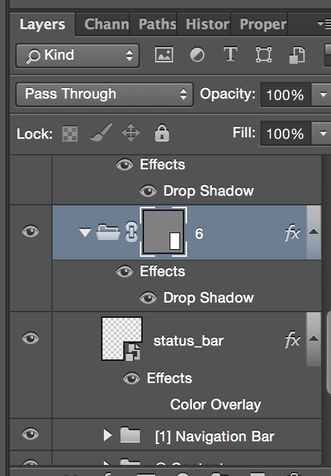
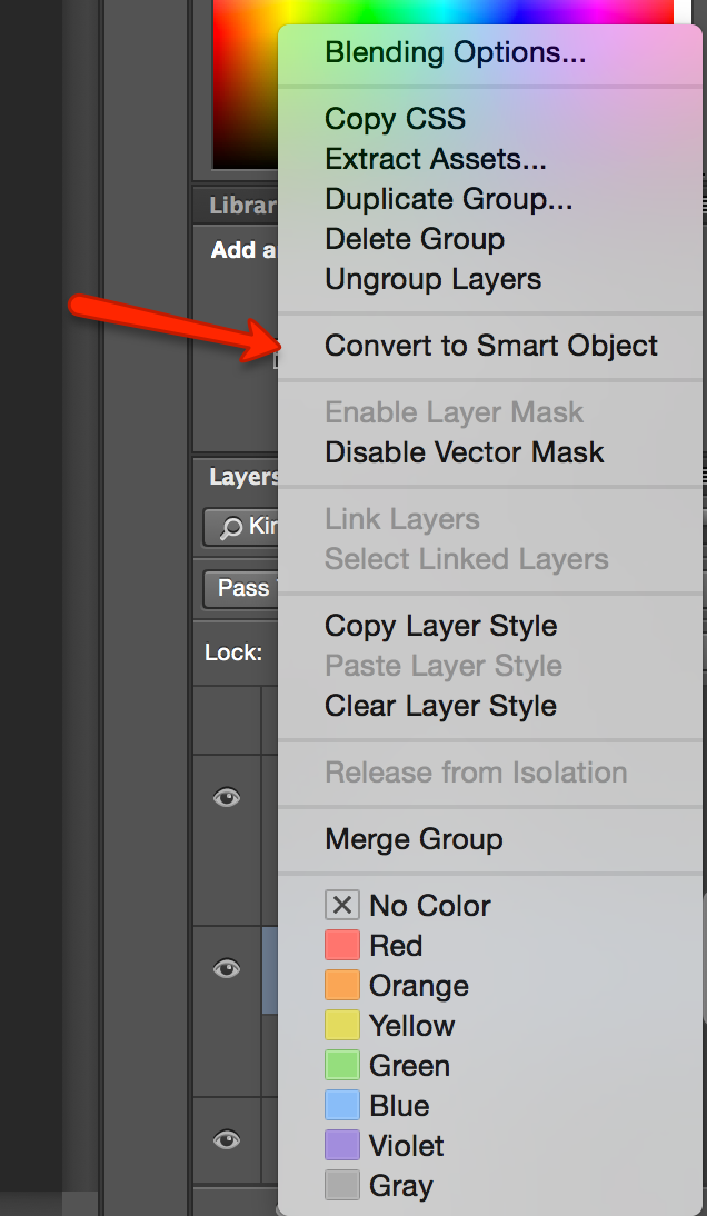
Right click the layer and select Convert To Smart Object.
| The right click menu will present different options when you click different areas of the layer, clicking on the left area of the layer works |
Once the layer hierarchy is a smart object you can just double click it which will open the sub hierarchy in a new tab and you now only have the pieces of the image you care about.
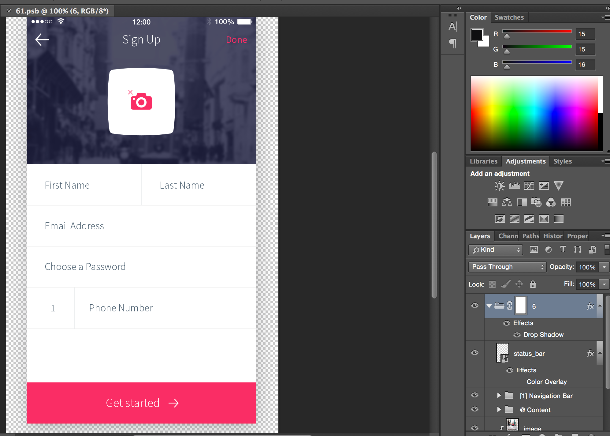
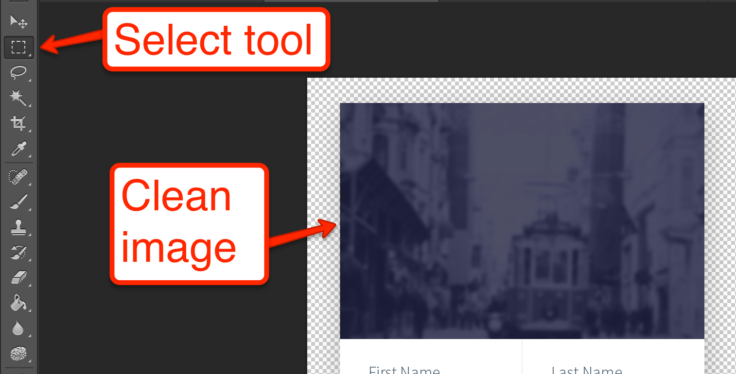
Removing the Noise
The first thing we need to do is remove from the image all of the things that we don’t really need. The status bar area on the top is redundant as if is a part of the phones UI. We can select it using the select tool and click the eye icon next to the layer to hide it.
Normally we’d want to have the back arrow but thanks to the material design icons that are a part of Codename One we don’t need that icon so we can hide that too.
We don’t need the “Sign Up” or “Done” strings in the title either but before removing them we’d like to know the font that is used.
To discover that I can click them to select the layer then switch to the text tool:
Then I can double click the text area layer to find out the font in the top of the UI like this:

| Notice that I don’t actually need to have the font installed in this case I don’t (hence the square brackets) |
Also notice that the color of the font is accessible in that toolbar, by clicking the color element we get this dialog which shows the color value to be f73267, this is something we will use later
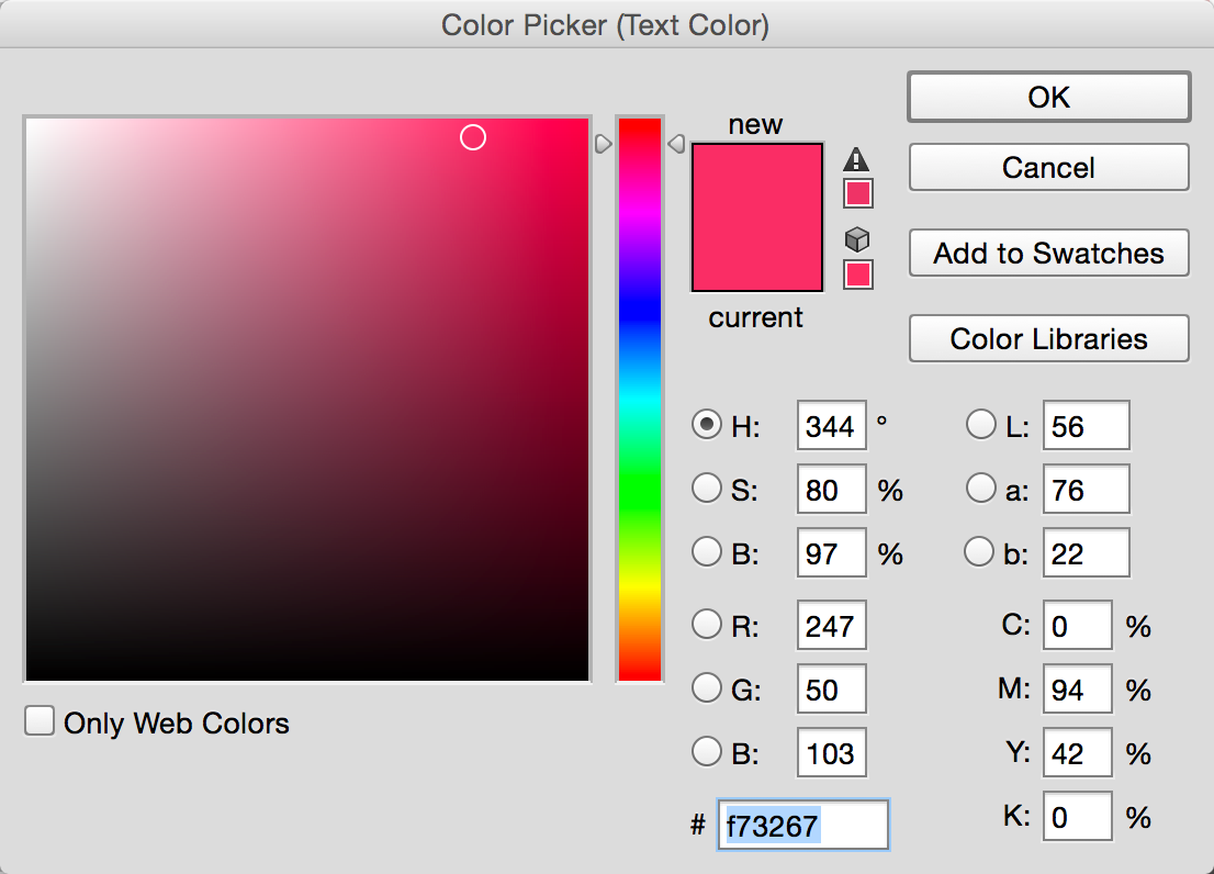
We can now hide both text layers so they won’t pose a problem later.
The Camera Button
The camera button includes an icon and the button background itself. You can just use that as a single image and be done with it, but for the purpose of this tutorial I will take the harder route of separating this into a button background and a foreground image.
When you click on the camera icon you will notice that the camera icon is comprised of two separate layers: the camera and the “x” symbol above it. We can select both layers using ctrl-click (command click on the Mac) and convert both to a smart object together using the same method as before:
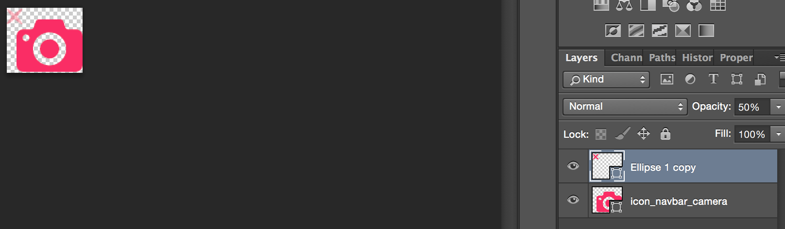
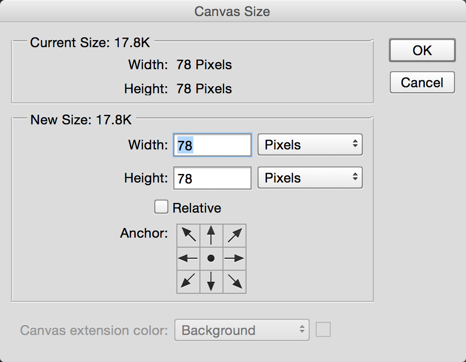
Since the image is used as an icon we want it to be completely square which isn’t the situation here!
This is important as a non-square image can trigger misalignment when dealing with icons and the background. So we need to use the Image → Canvas Size menu and set the values to be the same (the higher value of the two).
We can now use File → Save As and save the first image resource we will need into a temporary directory. Make sure to save a PNG file to preserve quality and transparency!
For convenience we’ll refer to the file as camera.png when we need it later.

We can follow the exact same procedure with the parent button layer (the white portion) which we can convert to a smart object and save as camera-button.png.

Now we can hide both of these elements and proceed to get the background image for the title.
Here the “smart object trick” won’t work… There is an effects layer in place and the smart object will provide us with the real underlying image instead of the look we actually want. However, solving this is trivial now that we hid all of the elements on top of the image!
We need to switch to the rectangular select tool:
Now drag the select tool to select the image don’t cross into the white pixels below the image. You can use the zoom value and set it to a very high value to get the selection right.
When the selection is right click Edit → Copy Merged. Normally Copy would only copy a specific layer but in this case we want to copy what we see on the screen!
Now click File → New it should have the Presets set to Clipboard which means the newly created image is based on what we just copied (that is seriously great UX). Just accept that dialog and paste (Ctrl-V or Command-V).
You can now save the image, since it’s just a background using JPEG is totally acceptable in this case. We named it background.jpg.

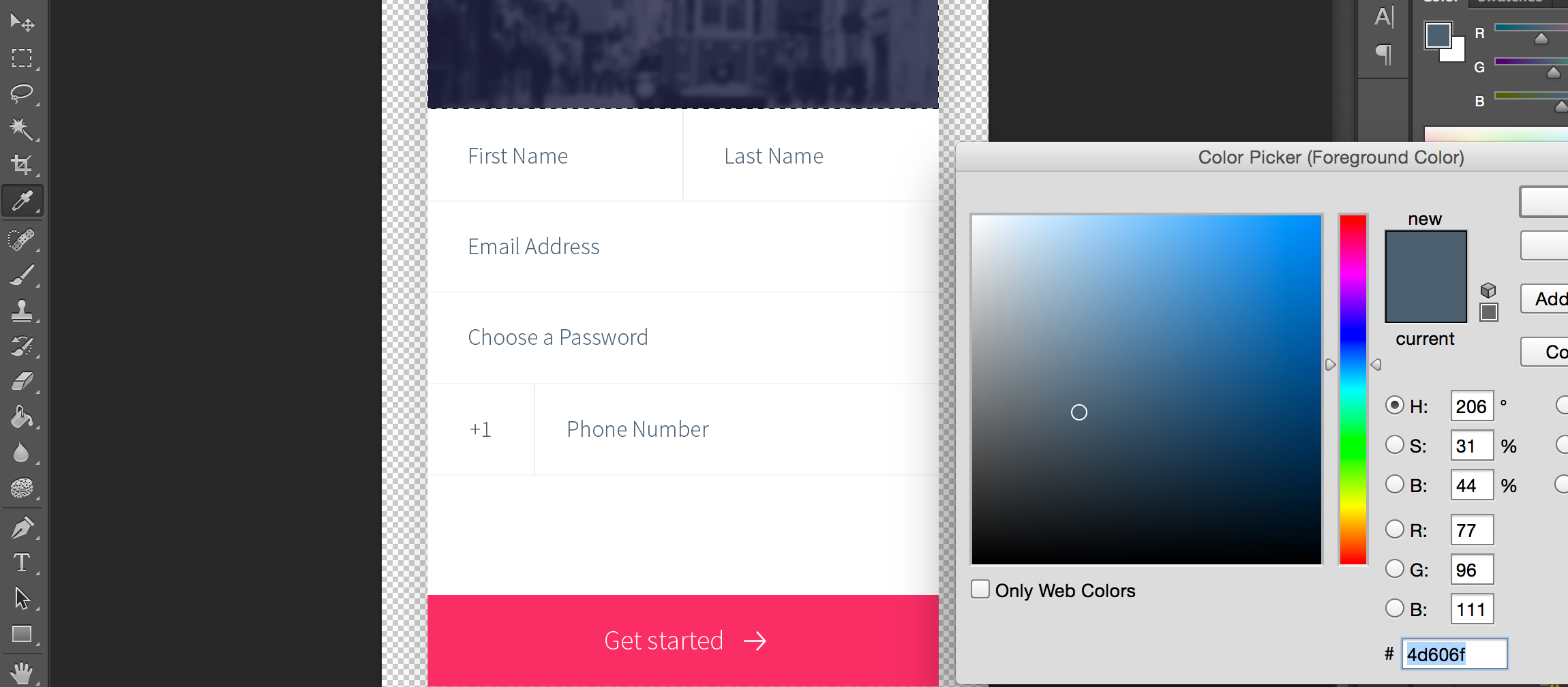
The last thing we need is the colors used in the UI. We can use the “eye drop” tool in a high zoom level to discover the colors of various elements e.g. the text color is 4d606f and the separator color is f5f5f5:
The Code
While that was verbose it was relatively simple. We’ll create a simple barebones manual application with the native theme.
| The reason for this is to avoid “noise”, if we use a more elaborate theme it would have some existing settings. This can make the tutorial harder to follow |
Once the project is created double click the theme.res file and within the designer select Images → Quick Add Multi Images. Select the 3 images we created above: background.jpg, camera.png & camera-button.png. Leave the default setting on Very High and press OK.
Then save the resource file so we can use these images from code.
Here is the source code we used to work with the UI above there are comments within the code explaining some of the logic:
private Label createSeparator() {
    Label sep = new Label();
    sep.setUIID("Separator");
    // the separator line  is implemented in the theme using padding and background color, by default labels
    // are hidden when they have no content, this method disables that behavior
    sep.setShowEvenIfBlank(true);
    return sep;
}

public void start() {
    if(current != null){
        current.show();
        return;
    }
    // The toolbar uses the layered mode so it resides on top of the background image, the theme makes
    // it transparent so we will see the image below it, we use border layout to place the background image on
    // top and the "Get started" button in the south
    Form psdTutorial = new Form("Signup", new BorderLayout());
    Toolbar tb = new Toolbar(true);
    psdTutorial.setToolbar(tb);

    // we create 4mm material arrow images for the back button and the Get started button
    Style iconStyle = psdTutorial.getUIManager().getComponentStyle("Title");
    FontImage leftArrow = FontImage.createMaterial(FontImage.MATERIAL_ARROW_BACK, iconStyle, 4);
    FontImage rightArrow = FontImage.createMaterial(FontImage.MATERIAL_ARROW_FORWARD, iconStyle, 4);

    // we place the back and done commands in the toolbar, we need to change UIID of the "Done" command
    // so we can color it in Red
    tb.addCommandToLeftBar("", leftArrow, (e) -> Log.p("Back pressed"));
    Command doneCommand = tb.addCommandToRightBar("Done", null, (e) -> Log.p("Done pressed"));
    tb.findCommandComponent(doneCommand).setUIID("RedCommand");

    // The camera button is comprised of 3 pieces. A label containing the image and the transparent button
    // with the camera icon on top. This is all wrapped in the title container where the title background image
    // is placed using the theme. We chose to use a Label rather than a background using the cameraLayer so
    // the label will preserve the original size of the image without scaling it and take up the space it needs
    Button cameraButton = new Button(theme.getImage("camera.png"));
    Container cameraLayer = LayeredLayout.encloseIn(
            new Label(theme.getImage("camera-button.png")),
            cameraButton);
    cameraButton.setUIID("CameraButton");
    Container titleContainer = Container.encloseIn(
            new BorderLayout(BorderLayout.CENTER_BEHAVIOR_CENTER),
            cameraLayer, BorderLayout.CENTER);
    titleContainer.setUIID("TitleContainer");

    TextField firstName = new TextField("", "First Name");
    TextField lastName = new TextField("", "Last Name");
    TextField email = new TextField("", "Email Address", 20, TextField.EMAILADDR);
    TextField password = new TextField("", "Choose a Password", 20, TextField.PASSWORD);
    TextField phone = new TextField("", "Phone Number", 20, TextField.PHONENUMBER);
    Label phonePrefix = new Label("+1");
    phonePrefix.setUIID("TextField");

    // The phone and full name have vertical separators, we use two table layouts to arrange them correctly
    // so the vertical separator will be in the right place
    TableLayout fullNameLayout = new TableLayout(1, 3);
    Container fullName = new Container(fullNameLayout);
    fullName.add(fullNameLayout.createConstraint().widthPercentage(49), firstName).
        add(fullNameLayout.createConstraint().widthPercentage(1), createSeparator()).
        add(fullNameLayout.createConstraint().widthPercentage(50), lastName);
    Container fullPhone = TableLayout.encloseIn(3, phonePrefix, createSeparator(), phone);

    // The button in the south portion needs the arrow icon to be on the right side so we place the text on the left
    Button southButton = new Button("Get started", rightArrow);
    southButton.setTextPosition(Component.LEFT);
    southButton.setUIID("SouthButton");

    // we add the components and the separators the center portion contains all of the elements in a box
    // Y container which we allow to scroll. BorderLayout Containers implicitly disable scrolling
    Container by = BoxLayout.encloseY(
                    fullName,
                    createSeparator(),
                    email,
                    createSeparator(),
                    password,
                    createSeparator(),
                    fullPhone,
                    createSeparator()
            );
    by.setScrollableY(true);
    psdTutorial.add(BorderLayout.NORTH, titleContainer).
            add(BorderLayout.SOUTH, southButton).
            add(BorderLayout.CENTER, by);


    psdTutorial.show();
}
Styling The UI
So the code above is most of the work but we still need to put everything together using the theme. This is what we have so far:
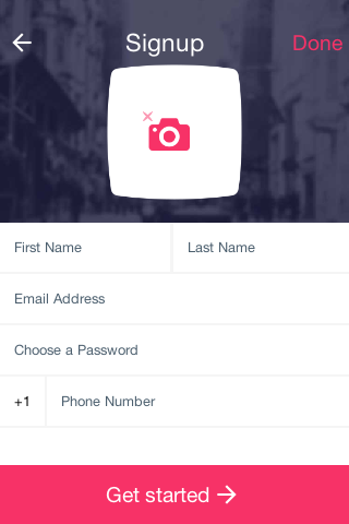
This looks like a major set of changes but it requires exactly 10 UIID definitions to get to this look!
Open the designer and select the theme. Press the Add button and type in TitleContainer. Uncheck derive for the background and select IMAGE_SCALED_FILL for the Type and the background.jpg image.
Define the padding as:
-
Left – 3 millimeter
-
Right – 3 millimeter
-
Top – 8 millimeter
-
Bottom – 2 millimeter
This will allow enough space for the title. Define margin as 0 on all sides. Then press OK.
Add the “Title” UIID. In the Color tab define the foreground as ffffff define transparency as 0 (fully transparent so we will see the TitleContainer). Define padding as 1 millimeter on all sides and margin as 0 on all sides.
In the Border tab press the … button and select [Empty].
In the Font tab select the True Type as native:MainThin. Select the True Type Size as millimeters and set the value to 3.5.
Press OK to save the changes.
Copy the Title UIID and paste it, change the name to “TitleCommand” and press OK to save the changes.
Copy the Title UIID again and paste it, change the name to “RedCommand”. In the Color tab set the foreground color to f73267. In the Font tab set the True Type to native:MainLight and set the size to 3. Press OK to save the changes.
Add the “TitleArea” UIID. In the Color tab define transparency as 0 (fully transparent so we will see the TitleContainer). Define padding and margin as 0 on all sides.
In the Border tab press the … button and select [Empty].
Press OK to save the changes.
Add the “TextField” UIID. In the Color tab define transparency as 255 (fully opaque) and the background as ffffff (white). Define padding as 2 millimeter on all sides and margin as 0 on all sides.
In the Border tab press the … button and select [Empty].
In the Font tab set the True Type to native:MainLight and set the size to 2. Press OK to save the changes.
Copy the TextField UIID again and paste it, change the name to “TextHint”. In the Color tab set the foreground color to 4d606f. Press OK to save the changes.
Add the “SouthButton” UIID. In the Color tab define transparency as 255 (fully opaque) and the background as f73267 (red) and the foreground as ffffff (white). Define Alignment as Center.
Define padding as:
-
Left – 1 millimeter
-
right – 1 millimeter
-
top – 2 millimeters
-
bottom – 2 millimeters
Define margin as 0 on all sides.
In the Font tab set the True Type to native:MainThin and set the size to 3. Press OK to save the changes.
Add the “CameraButton” UIID. In the Color tab define transparency as 0 (fully transparent). Define Alignment as Center.
Define padding as:
-
Left – 1 millimeter
-
right – 1 millimeter
-
top – 3 millimeters
-
bottom – 1 millimeter
| This helps spacing away from the title |
Define margin as 1 millimeter on all sides.
Press OK to save the changes.
You can now save the theme and the app should look like the final result!
Not Quite There Yet
There is one last piece that you would notice if you actually try to run this code. When pressing the buttons/text fields you would see their look change completely due to the different styles for focus/press behavior.
You can derive the regular styles from the selected/pressed styles but one of the simplest ways is to just copy & paste the styles to the pressed/selected tabs. We can copy CameraButton, RedCommand, SouthButton & TextField to the selected state. Then copy CameraButton, RedCommand & SouthButton to the pressed state to get the complete app running!

9 Comments
Dear Shai, Separator UIID is missing. Will you please provide it as I am having a gap between the text fields and the gray line is not appearing.
Se is defined like this with 1 pixel padding on all sides and 0 margin
[https://uploads.disquscdn.c…](https://uploads.disquscdn.com/images/5da34acc1f73d0339aa76937c859830a2cc09b7e44e2bc225d9199a13392f9b2.png)
Thank you soooo much dear really appreciate your help a lot!!!
Dear Shai, I am so surprised to see that the toolbar on android has still white background while it works fine on ios. Also when I change the device on the simulator from ios 6 plus or android Samsung S7 to other samller devices the screens look ugly and the toolbar becomes white the the title area appears even though I have hidden it. Please help!!
Override the border of title area UIID as empty.
very nice very nice thanks a million!!
can any one give me the java code for the first basic form. the one without styling. please. thank you so much in advanced
I am having difficulties with netbeans running the simple signup form. can anyone help with the code and all plugins please.
There is one plugin and that is the Codename One plugin which you can install via the download section of this website. It also includes the code for this demo if you go to File -> New Project -> Codename One -> Demos you would see the PSD demo code