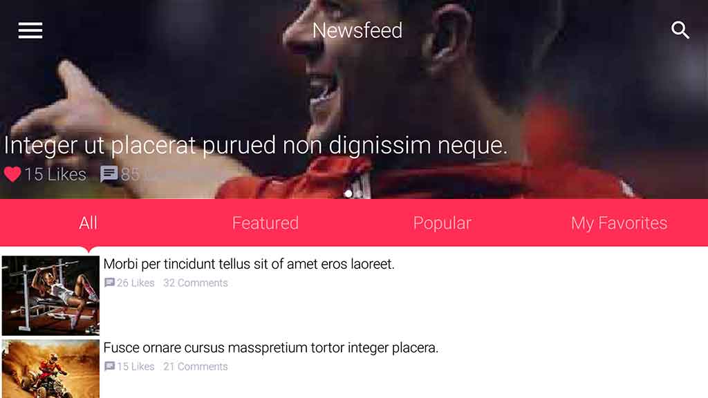
In the previous template post I introduced a material
design inspired theme. This time the theme I chose is simpler “cleaner” but not necessarily easier to integrate.
I’ve had quite a few difficulties wrestling with Photoshop oddities (bugs?) that made this template painful,
hopefully I’ve narrowed down the process enough so this should become easier.
The PSD I chose this time is the Clean Modern
UI Kit which is heavy on background images and a minimalist on all other aspects. You can check out the
full git repository of the work here.
As usual you can check out the full app running on the right thanks to the JavaScript port and device screenshots
at the bottom of this post…
Porting the theme was relatively simple and I had very few issues, I made several choices that were interesting
in the design so I’ll go over them below.
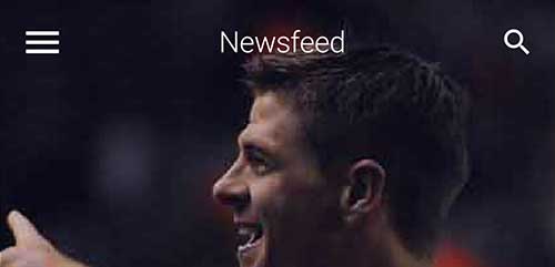
Disabled Global Toolbar
I used the Toolbar in the demo but disabled it’s global default. I did this so I can create my own Toolbar instances
using the layered mode which we create using new Toolbar(true).
This allows the Toolbar to hover on top of the UI and is very useful for a transparent Toolbar effect where the UI
is drawn under the Toolbar.
E.g. we use this in the news & profile page. In those pages we could have styled the Toolbar to have the image within
it instead of taking this approach. However, that would have made some effects harder to customize.
Arrow Down Effect
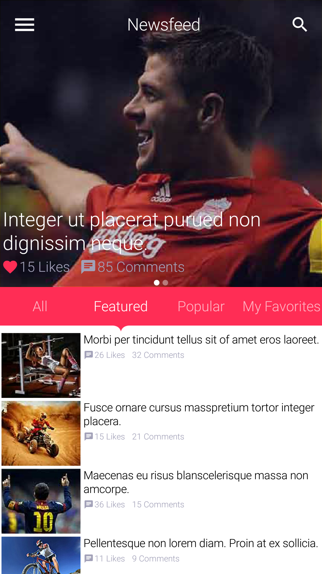
One of the more challenging effects was the arrow bar pointing downwards at the selection.
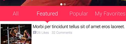
I started off by looking at this as a Tabs Container but eventually chose to use a set of RadioButton components
in toggle button mode. The main challenge is positioning the arrow in the “exact” center. We have an
arrow border feature but it’s a bit clunky and I didn’t want to make use of that (rewriting this is on my personal
“todo list”).
The arrow is really just a label aligned to the bottom whose padding I change based on radio button selection and
device orientation.
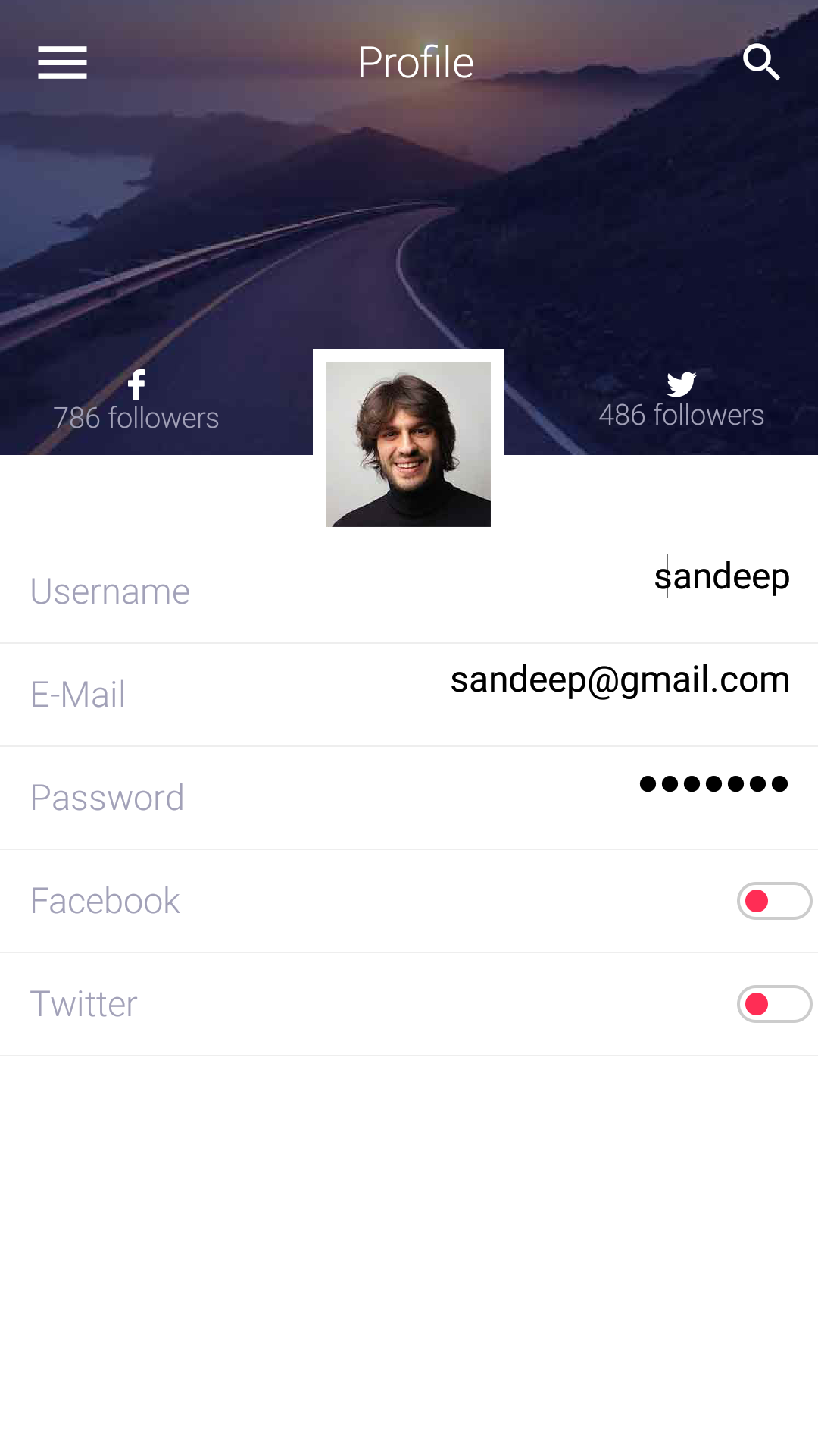
OnOffSwitch
One painful point was the on-off switch design which I was too lazy to replicate with our OnOffSwitch.
I ended up using a toggle button with two image states which isn’t a good solution.
I’m thinking about rewriting the OnOffSwitch code to use the new capabilities of the API such as RoundBorder
and possibly shape clipping. I’m not sure when we’ll get around to it as there is so much work and this is a non-trivial
task.
End Result
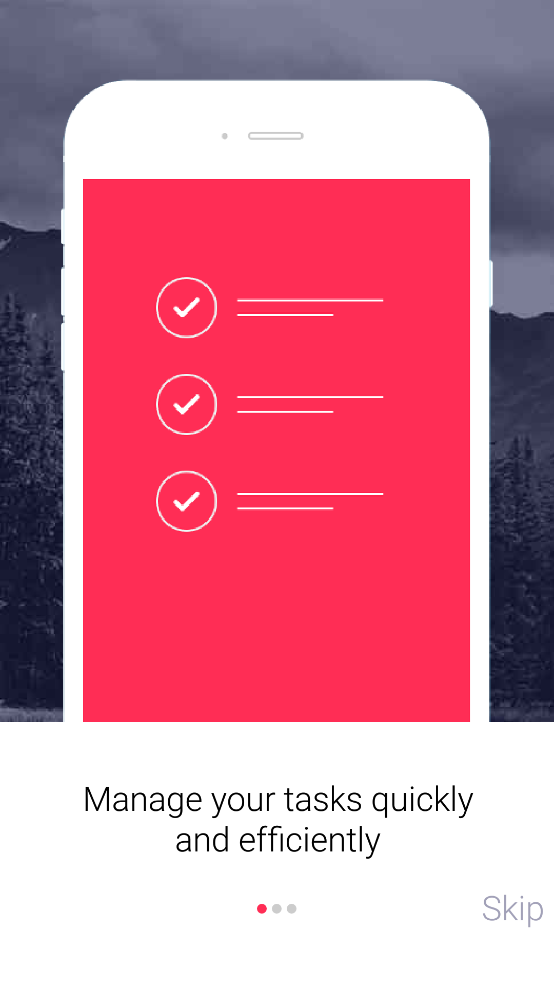
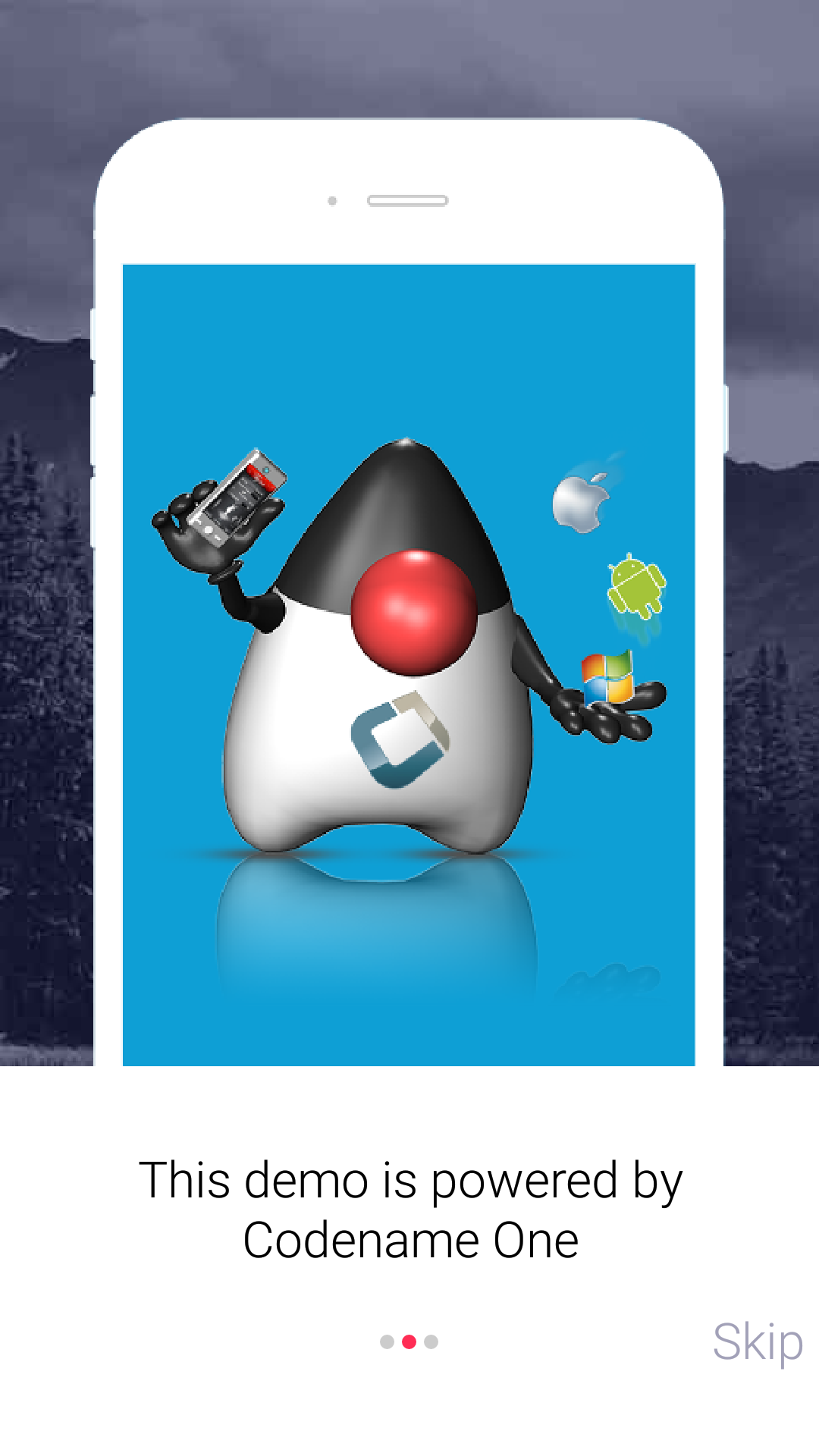
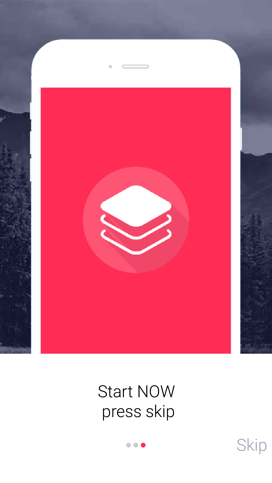
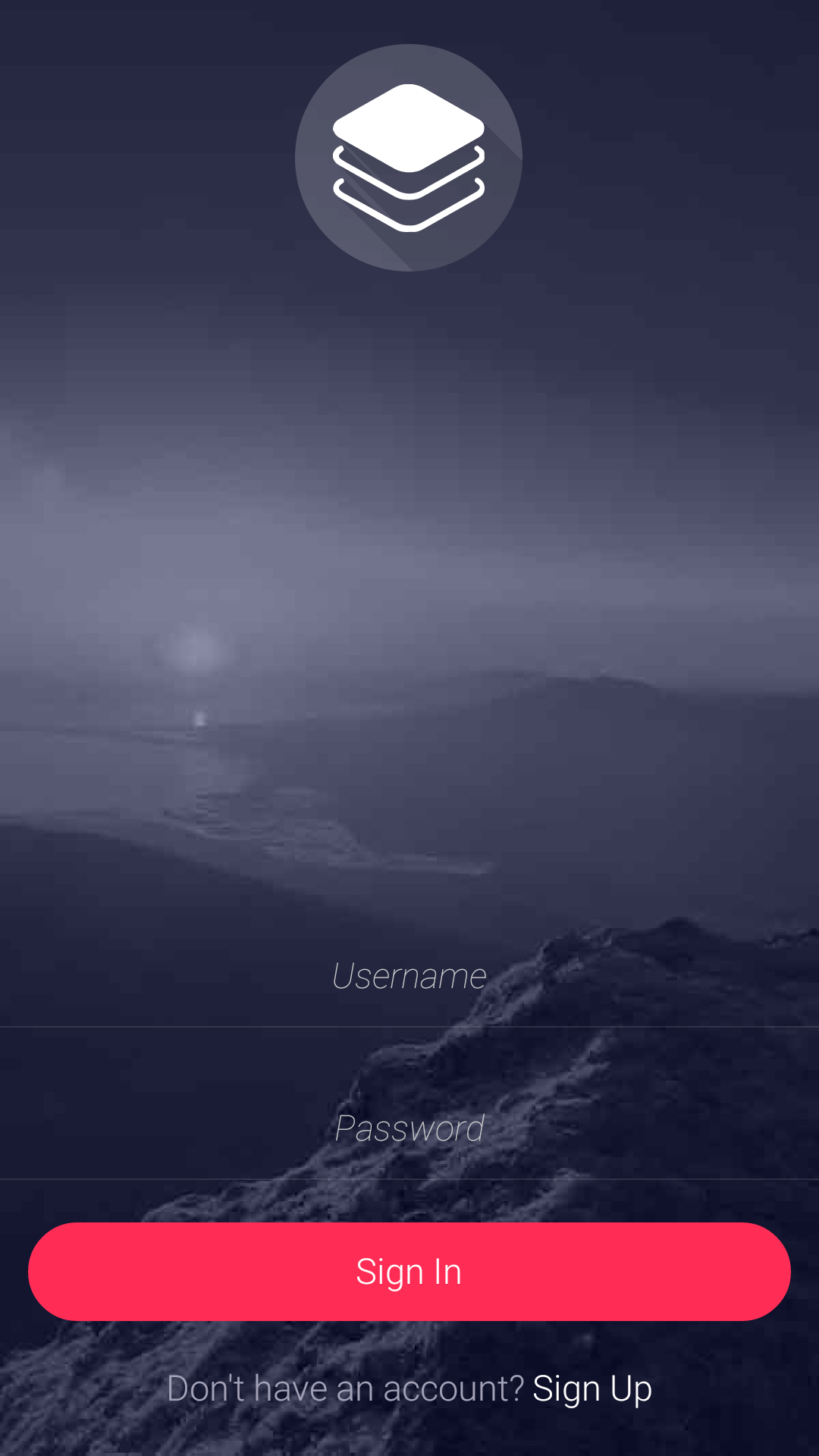
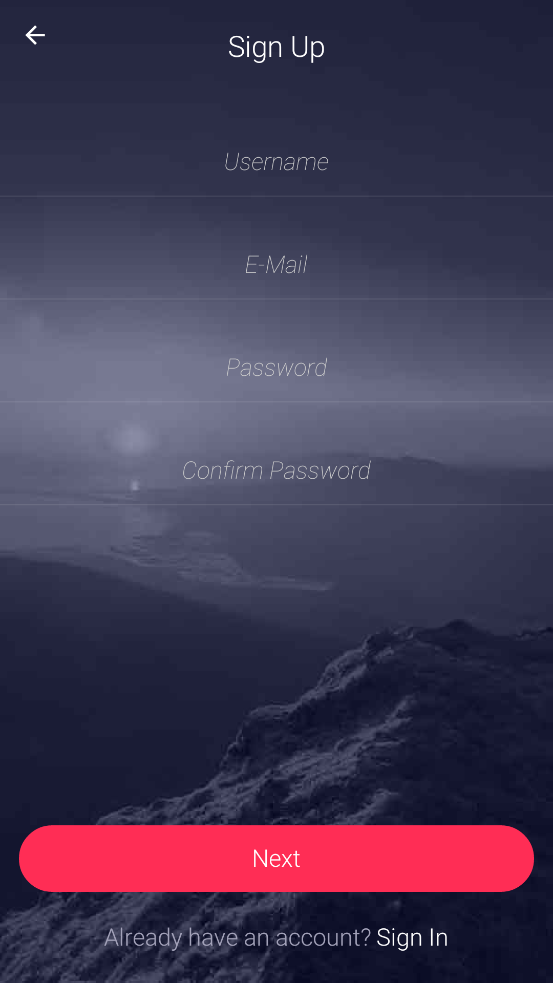
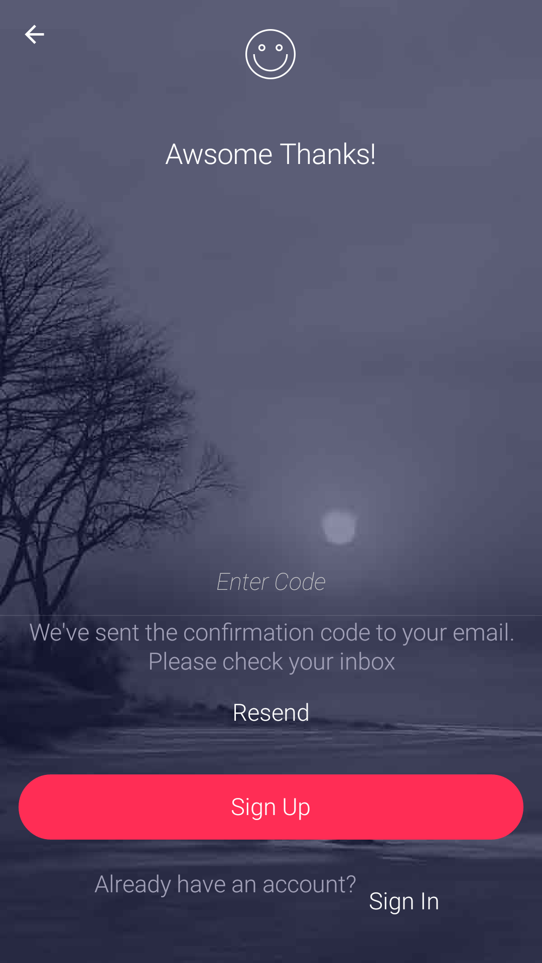
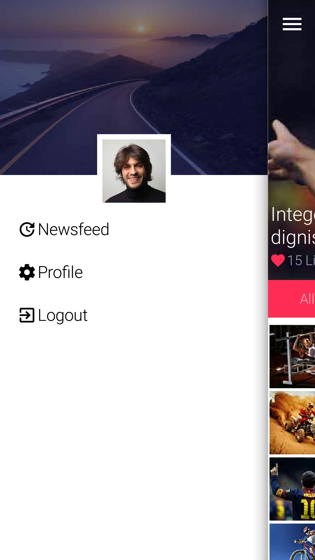
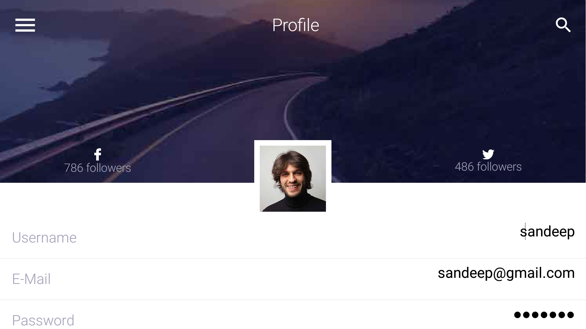
Below are screenshots from my One Plus One Android device, notice the way the UI adapts to landscape mode
as well.

Final Word
This took longer to build than I’d hoped mostly because of photoshop oddities and the sheer number of forms.
In the future I might limit the number of forms just to get stuff out of the way.
Many of these forms are repetitive and I skipped at least two forms from the design which I just couldn’t
complete in time.



15 Comments
Just downloaded onto a device, and it looks nice. Good job.
I was playing with the javascript port of the app from the browser. It looks good, but the app froze in the browser when accessing profile info and clicking on the search button. Not sure if this is the exact cause.
Thanks, I just added a search button for the look and didn’t test it.
Turns out that the search bar feature doesn’t work with the layered toolbar mode
Getting a “cannot find symbol” in NewsfeedForm
Component.setSameSize(radioContainer, spacer1, spacer2);
I updated to latest plugin…what I am missing?
Go to settings and click the update client libs button to update the packaged libraries.
Thanks! I’ll remember that…”refresh cn1libs files” was not enough
Love this new design!
Dear Shai, I have tested this app from the plugin in the simulator but found that in all forms the title area in the middle between the search button and the side menu symbol is always a black rectangle. I tried setting the TitleArea UIID transparency to zero but still didn’t work. The right and the left side of the toolbar are showing the background image but only the rectangle between the search button and the side menu symbol is black!!!
Can you provide a screenshot?
How did you test the app? Did you use the wizard?
[https://uploads.disquscdn.c…](https://uploads.disquscdn.com/images/e3c7138091595c2ac57011db2bc492031009fd1d0bc7743fd122eda0694d2d52.jpg)
This is a screen shot of the Profile form, for example, as you can see with a black rectangle on the middle of the tool bar. I have used the wizard as part of the demo that is bundled with the plugin. I have codename one plugin version 3.6 in netbeans. I have used the simulator in this screen shot.
Which skin is that?
Just tried that on a couple of iOS skins and nothing…
Which IDE are you using?
[https://uploads.disquscdn.c…](https://uploads.disquscdn.com/images/c9a32186e7d4bcd03687b5cb0f7419f22edbe9f0330b60390c41682c17a8a880.png)
Dear Shai, you are right. This is only happening with the iphone6plus skin. I am using netbeans 8.2. Does this mean if I deploy the app to a 6plus iPhone it will have the same issue??
No that’s a bug in the skin. We just fixed that. Can you please go to the more skins menu and update the skin from there. It should fix the problem after restarting the simulator.
Thanks a lot Shai. It’s working even better now with a very nice animation!!!
how can i downoald a template ?
It’s in the plugin