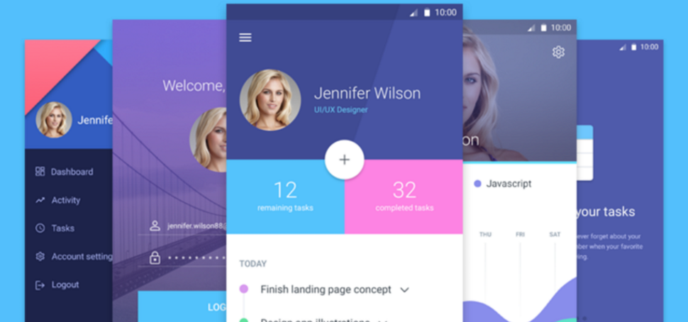
Generating a template from a PSD isn’t hard but it isn’t a trivial task either, in this recurring segment I will try to
generate good looking Codename One templates from freely available PSD files. Since this requires some
effort I don’t think I’ll be able to keep this as a weekly segment but I’ll try to post such a template once every
two or three weeks. If you know of a free PSD that you’d like to see as a Codename One app point me at it
in the comments and I might integrate it in a future post!
Unlike previous tutorials I won’t cover the process of extracting the
template and building it as this will take MUCH longer than just doing it. I will try to discuss the highlights,
compromises etc. You can study the source code/theme and ask questions in the comments if something
I achieved is unclear.
This time I will port the Mobile Screens Material UI PSD.
This is not from Google but it based on the Material design principals.
You can check out the full source code on github here.
The End Result
I’m pretty pleased with the end result, this took me about a day and a half of work to do. The app build is 478kb
well bellow the free quota limit and this is with full HD resources. The resulting Android APK is 1.8mb which is
pretty small for an app like this.
Check out a preview of this UI running on the right here thanks to the JavaScript port of Codename One,
notice that you can also launch this same preview in full screen here. You can also
download the Android APK to your device from here. We can’t
distribute demos thru appstores due to vendor restrictions so you will need to build for other platforms on your own…
When running the demo you can switch between the charts/profile pages by clicking any entry in the sidemenu.
You can restart the demo by clicking logout. You can also swipe the welcome form. I explicitly avoided implementing
any form of functionality to keep things relatively simple.
You can see the PSD’s we used as a base in this directory.
I extracted very few images from the PSD’s and mostly used the colors and components where possible, you can
see the exact image resources I extracted and used
here. Notice I provided
a duke image of our own since the swipe tutorial only had one page designed in the PSD and I had to makeup
another page.
Below are screenshots of this app running on my OPO Android device:
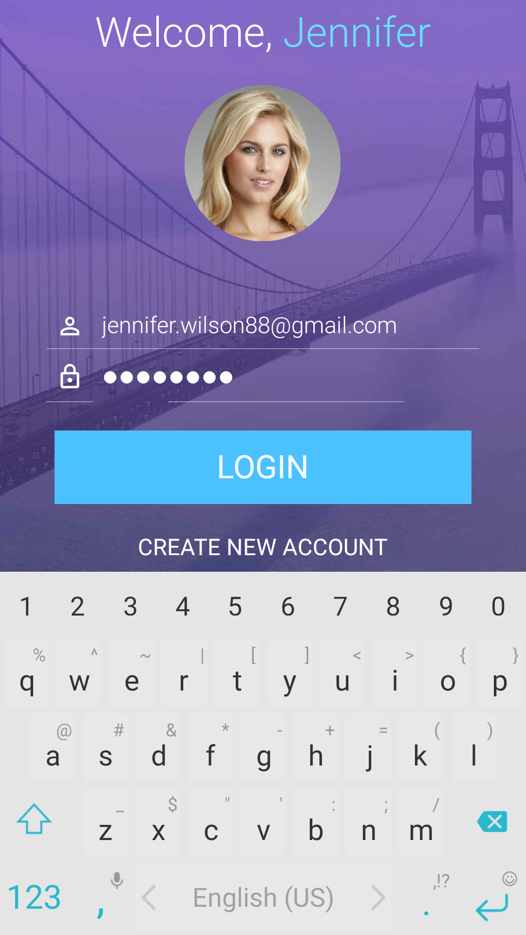
Figure 1. Login screen
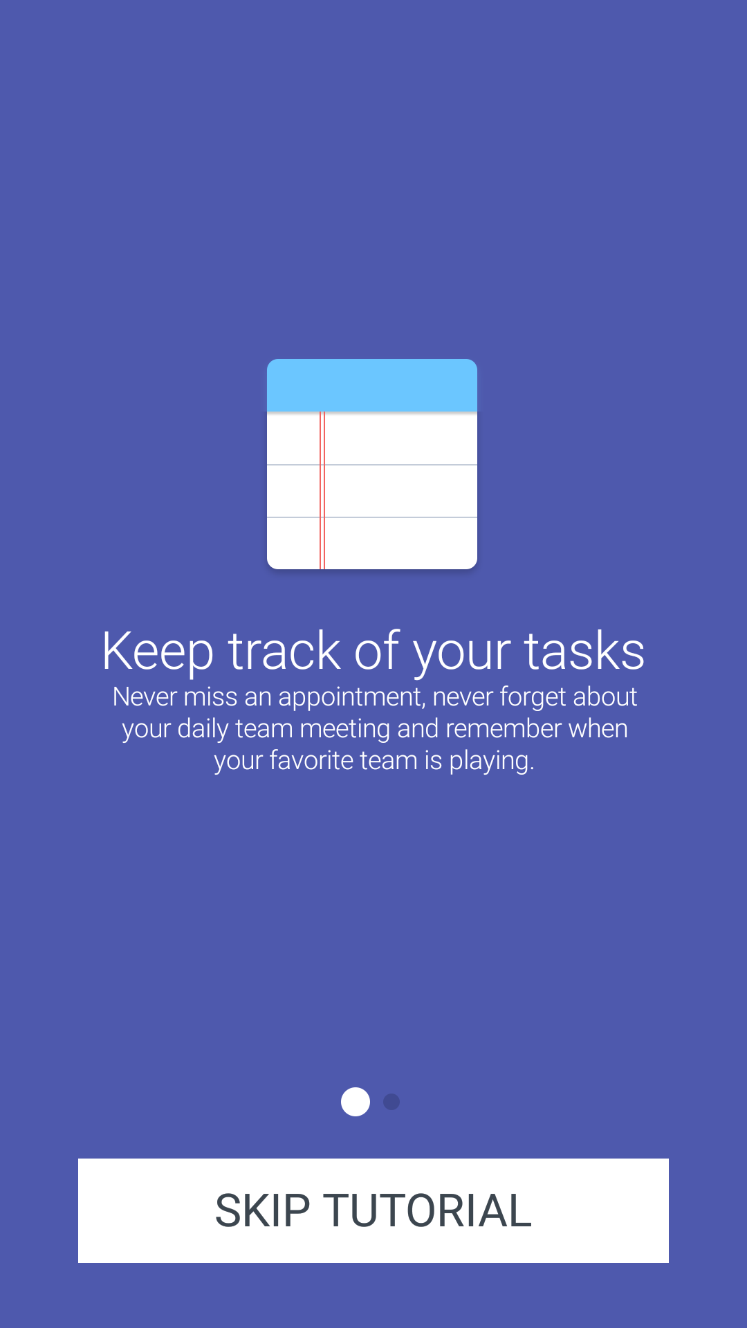
Figure 2. Welcome wizard page 1
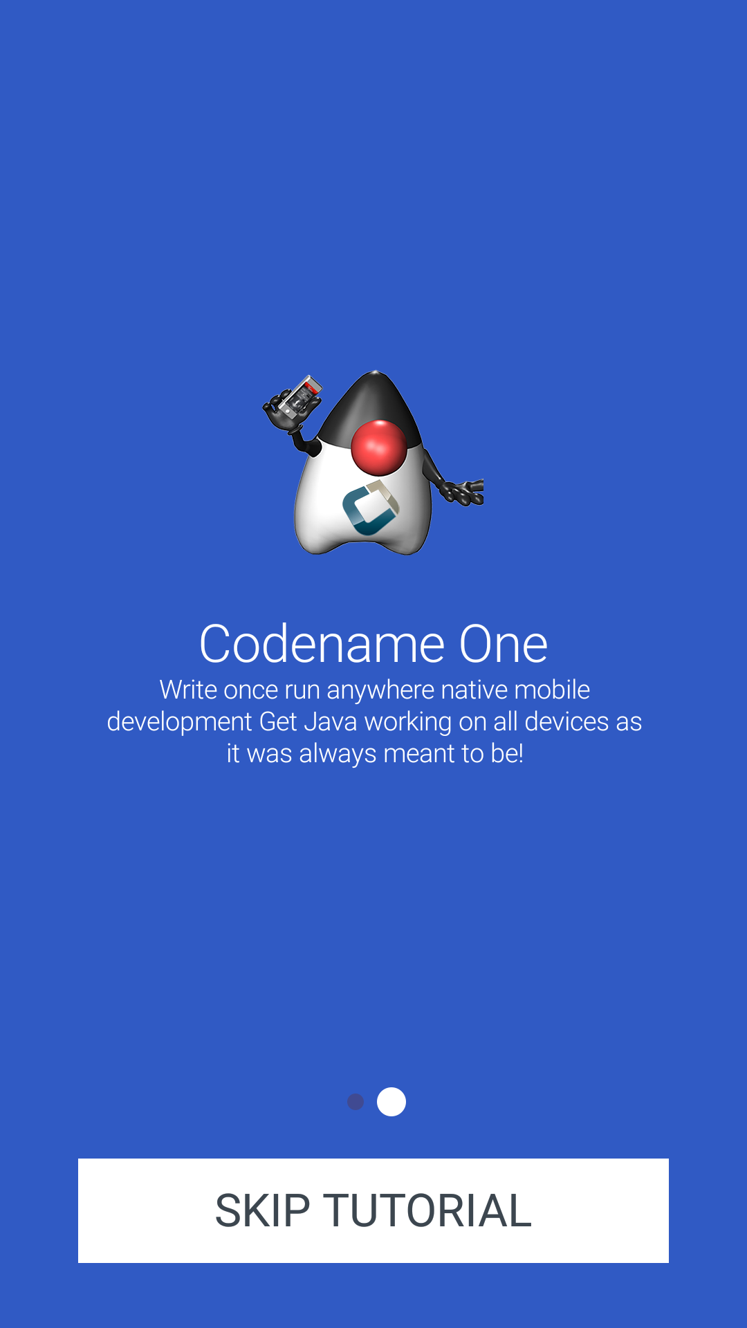
Figure 3. I designed another page for the welcome wizard so we’ll have 2 pages…
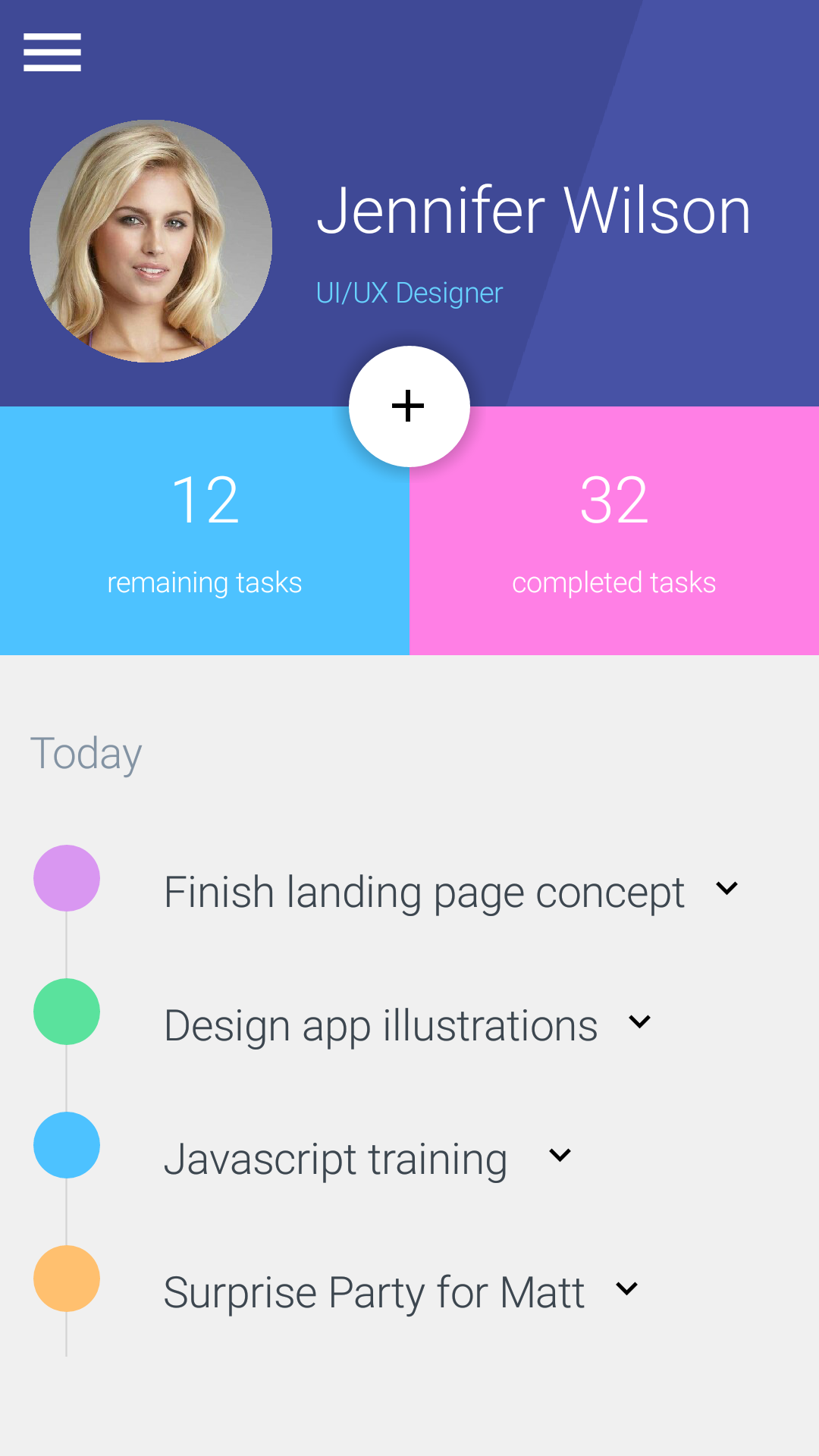
Figure 4. User form with complex toolbar
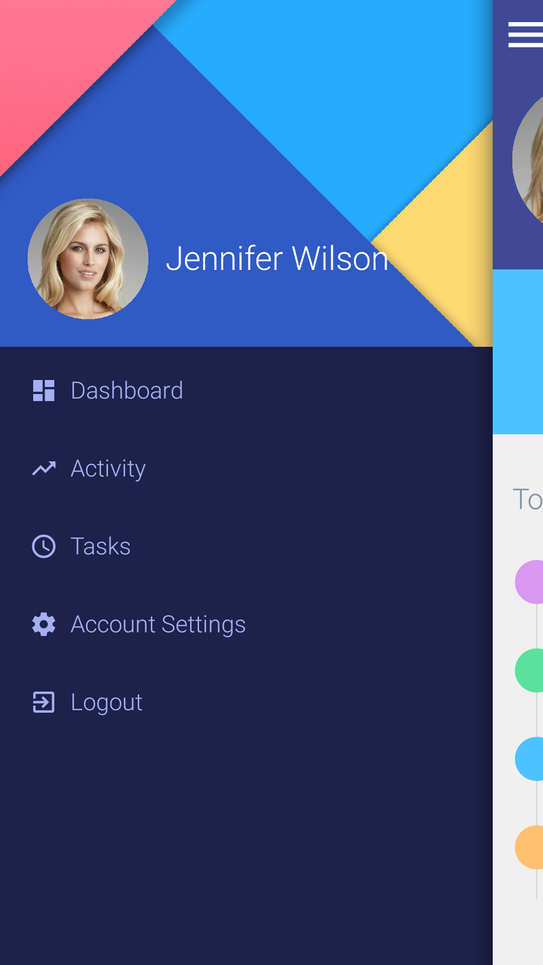
Figure 5. Sidemenu for the user form and chart form
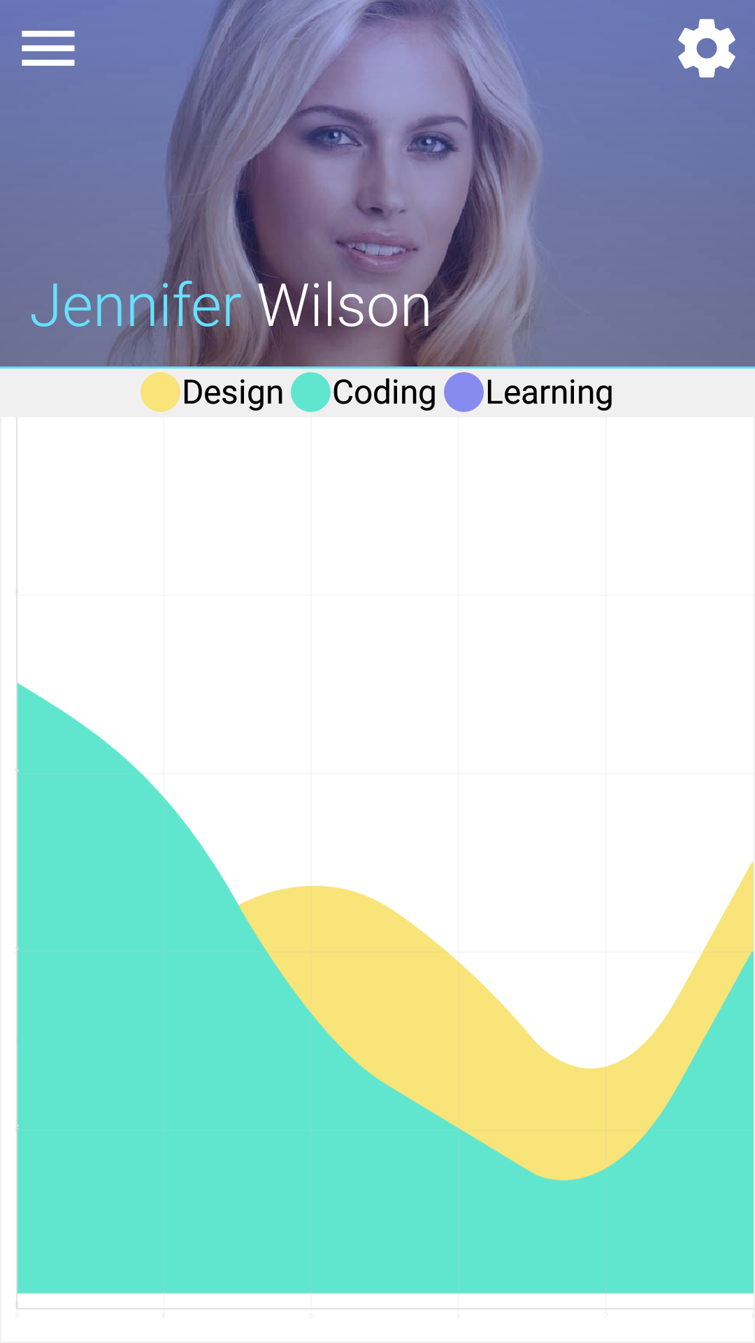
Figure 6. Chart form, I’m not sure if the original chart design is doable in any tool…
The UI
I’ve learned a bit about how we can make Codename One more friendly to UI designs, I’ll incorporate some of
these lessons into an update of this demo and make some changes to Codename One. I’ll go into more details
on that in an upcoming post.
I chose to design all the forms as subclass of Form, this isn’t necessarily the best way but it’s a common pattern
that’s intuitive to most developers.
This allowed me to unify the code for the side menu which appears on two of the forms.
The title areas in this demo are either non-existent or heavily customized to the point of being a purely custom
component. This posed some challenges sometimes with the builtin functionalities (e.g. status bar, menu icon etc.).
As a result I just hid the menu bar icon entirely and added one of my own.
A potential enhancement would be to shrink the title as we scroll down like this.
Final Word
After this is cleaned up a bit I’d love to have this template as part of our builtin demos, I’d also like to build more
of those as I feel this is a great learning tool for us and for you.
I’ll try to post a followup article about the improvements required to make this code easier.
Archived Comments
This post was automatically migrated from the legacy Codename One blog. The original comments are preserved below for historical context. New discussion happens in the Discussion section.
Bayu Sanjaya — October 11, 2016 at 12:45 pm (permalink)
Bayu Sanjaya says:
This is awesome. Clean and clear. Will try this.
Chidiebere Okwudire — October 11, 2016 at 1:03 pm (permalink)
Chidiebere Okwudire says:
Nice. Getting inspired… Can you share the URL from which you downloaded the free PSDs?
Shai Almog — October 11, 2016 at 1:32 pm (permalink)
Shai Almog says:
faugan — October 12, 2016 at 3:02 pm (permalink)
faugan says:
hi,
i am trying to integrate the new material screen ui kit project that i
have just download from github into my netbeans, but i am having some
error, the first one is import
com.codename1.components.FloatingActionButton; the FloatingActinButton
seems not to be in the list of component, how can i fix that? (that
error is in the file “ProfileForm.java line 22″) , The second error is
in the file SideMenuBaseForm.java from line 66 where we have
getToolbar().addMaterialCommandToSideMenu, how can i fix these two
errors, FWI i have create a new project then i copy one by one the files
from the project i have downloaded from github
Shai Almog — October 13, 2016 at 2:22 am (permalink)
Shai Almog says:
Hi,
You are using an old version of the Codename One libraries. You need to update to the latest.
faugan — October 13, 2016 at 9:30 am (permalink)
faugan says:
Thanks i updated my codename one and it works, thanks, great work guys
Adebisi Oladipupo — February 20, 2017 at 10:03 pm (permalink)
Adebisi Oladipupo says:
I downloaded this material UI Kit into INtelij but could not run it. I saw it shows errors on the java files that may be causing this. Also, I am unable to open the included forms in GUI builder probably due to the same reason. Should I be importing this project or opening it in my IDE? What settings do I need to change when trying to learn from these samples? I had this problem before with Chrome demo when I opened a downloaded copy. But the issue was corrected by creating a new project and selecting from the demo tab. However, this material UI Kit is not listed in the demo tab and I am stuck. Please help.
Shai Almog — February 21, 2017 at 7:06 am (permalink)
Shai Almog says:
Make sure your plugin is up to date. You don’t need to download it as the material demo (MSUIKit) is available in the new project wizard there. You can also follow this guide on setting up a project from git: https://www.codenameone.com…
Adebisi Oladipupo — February 21, 2017 at 1:57 pm (permalink)
Adebisi Oladipupo says:
I suppose the samples are done in NetBeans as the sample is not in Intellij IDE. I will follow the workaround in the link you provided for my IDE. Just curious. Is the latest plugin v3.6 as that is what I have in IntelliJ?
Shai Almog — February 22, 2017 at 7:13 am (permalink)
Shai Almog says:
It’s supposed to be in IntelliJ too. Just looked in the code and it seems we have an issue there. We’ll fix it for the next update.
Adebisi Oladipupo — February 22, 2017 at 8:42 pm (permalink)
Adebisi Oladipupo says:
Great. That way I don’t have to switch IDE from IntelliJ. Thanks
Discussion
Join the conversation via GitHub Discussions.