Chen has been working quite a bit on the new GUI Builder and made some significant changes both to it’s look and
functionality. These changes are wide reaching covering the appearance, functionality and stability of the GUI Builder.
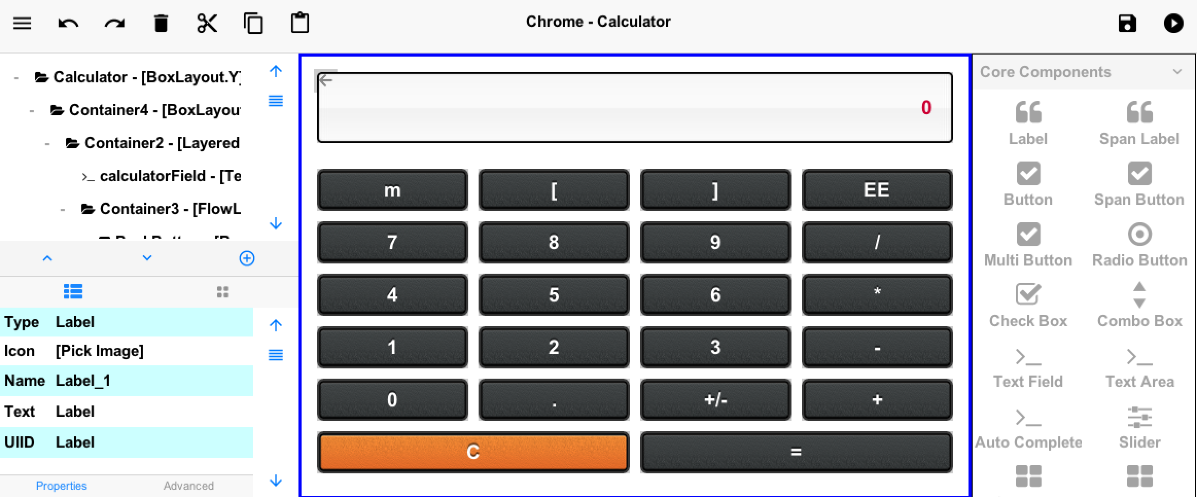
Figure 1. Starting page after recent changes see if you can spot them all…
Palette Relocation
The component palette is using an accordion now and was relocated to the right side of the UI. It is also available
as a popup below the tree…
If you select a node in the tree and press the + sign below the tree you will see the palette entries and you can click
one of them to add it into the given node as such:
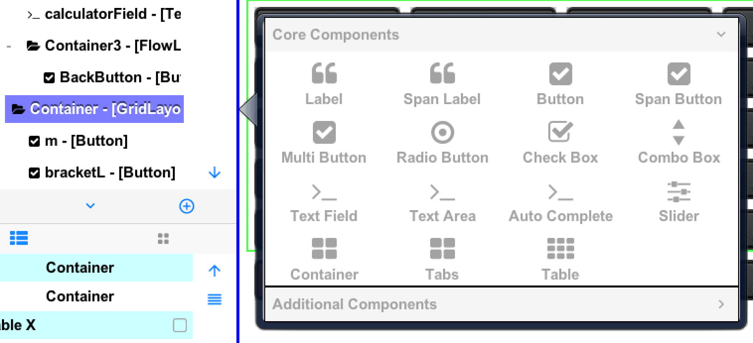
Figure 2. New popup palette UI
Up/Down Move
Entries in the tree can now be moved up/down the tree even between container boundaries.
You can do this by selecting an entry and pressing the up arrow ^ or similar down arrow next to it below the tree.
This is useful for simple reordering without drag and drop. Ideally we wanted to enable drag & drop in the tree but
this collides with the scrolling functionality to some degree so we took the lazy approach.
Material Icons Support
You can now pick a material design icon directly from the designer. When you click any icon property you will
see this dialog
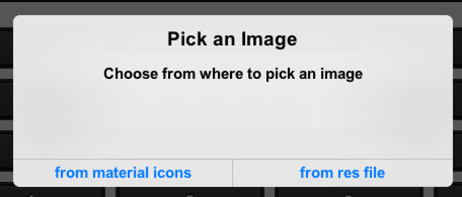
Figure 3. Pick material icon or image from the resource file
If you choose to pick an image from the material design icon font you will be presented with a dialog like this
coupled with a search field:
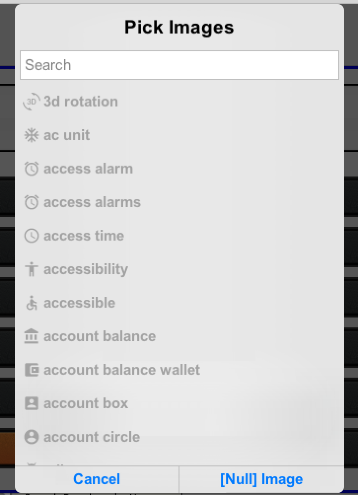
Figure 4. List of material design icons
Missing In Action
As part of these changes we removed a couple of features, let us know if they matter to you.
Multi Select – This was a very powerful feature that allowed editing multiple entries at once & enclosing them
in a parentContainer. It had confusing usage and a few lingering bugsPalette Search – When migrating the palette from a Container to an Accordion search was removed. I personally
liked that search a lot and used it quite a bit as I prefer typing
We have internal debates on whether these features are “really” needed/used. If you used them and want them
back let us know!
Moving Forward
We hope to release a plugin update this coming Friday which will include all of these changes…
Where do we go from here is very much up to you!
We need your bug reports, suggestions and requests to tune the designer to match your workflow. Naturally we
can’t entertain every request/suggestion but we try to listen and base our work on your needs.
Archived Comments
This post was automatically migrated from the legacy Codename One blog. The original comments are preserved below for historical context. New discussion happens in the Discussion section.
disqus — October 12, 2016 at 4:14 pm (permalink)
Updated netbeans plugin to Version: 3.5.5. Post update GUI Builder button events not functional after update. On looking at the generated code found this
public void actionPerformed(com.codename1.ui.events.ActionEvent ev) {
com.codename1.ui.Component sourceComponent = ev.getComponent();
if(sourceComponent.getParent().getLeadParent() != null) {
sourceComponent = sourceComponent.getParent().getLeadParent();
}if(sourceComponent == gui_Button) {
}
}which should be
if(sourceComponent == gui_Button) {
onButtonActionEvent(ev);
}Kindly fix the problem and let me know how can I do a dirty fix till then because this is generated code and gets overwritten everytime.
Chen Fishbein — October 12, 2016 at 6:33 pm (permalink)
Thanks, it will be fixed for the next update.
In the meantime you can just add an ActionListener to your Button right after the call to initGuiBuilderComponents
Chidiebere Okwudire — November 1, 2016 at 10:02 am (permalink)
How does the new GUI builder paradigm work with (UI) inheritance?
Use case: Several forms share a lot in common (custom header/footer/common body layout). As such I would like to have a base form and in subsequent forms, include the form content in my custom body layout. A quick look didn’t reveal any obvious way to achieve this without overriding the Form.addComponent() methods…. Please share your thoughts on how this can best be realized
Shai Almog — November 1, 2016 at 10:17 am (permalink)
We did just that in the new Phoenix demo, all forms derive from a common base form for the common side menu.
Chidiebere Okwudire — November 1, 2016 at 11:00 am (permalink)
Chidiebere Okwudire says:
Perfect timing. I’ll have a look!
disqus — November 5, 2016 at 8:59 pm (permalink)
disqus says:
working in the new version of the plugin 3.5.7
Shai Almog — November 6, 2016 at 4:23 am (permalink)
Shai Almog says:
Right click the project. Select properties and click OK in the properties dialog. Try running the project again.
Francesco Galgani — June 16, 2017 at 1:30 pm (permalink)
Francesco Galgani says:
I recently found this old blog post, that clarify why I didn’t find the “Multi Select” feature that is indicated in the developer guide (that should be updated).
I think that is very important to be able to put some components in a container easily (and viceversa, that is put some components out of their container).
The actual New Gui Builder has a lot of issues: if you change a value in the properties (like a component name), the tree is not updated; if I add two buttons and a container, I cannot drag and drop the buttons in the container (I can use move up/down buttons, but they are not convenient if I have a lot of components); if I select a container in tree and click on Cut, that container is still shown (the tree is not updated); if I select again that container and I click on Cut, I get the error “No component is selected”; if I cut and paste a component, its name will be changed; if I set a nested container as BorderLayout and then I click in tree to a button inside it, the box below the tree remain as it is, showing the layout of the container instead of properties of the button; I exerienced that in the preview some components are missing, but they are shown clicking on the Preview Design icon; if I set a container with a Table layout, in the settings I can set rows and columns only, I cannot customize every cell like in an html table; etc., maybe I did not understand how to use Gui Builder, but in my opinion it’s buggy and difficult to use. I’m waiting for a new version of the Gui Builder, thank you for your effort to make it better 🙂There is also a small bug both in the Gui Builder and in the Codename One Designer: some menu items are not shown when I click on the menu. For example, in the Gui Builder if I click on “File” I’ll see the underlying commands (Save, Exit), but if I move the mouse cursor to “Edit” or “Help” no commands underlying Edit or Help are shown (to get them, I have to click again on Edit or Help). In the Codename One Designer, the issue is a bit different: for example, I click on the menu voice “Codename One”, I see: Signup, Login, a blank space, Advanced. To see the “Live preview” item istead of the blank space (and other missing items replaced by blank spaces), I have to set the Look&Feel as cross-platform every time that I open the Designer (however I prefer the System Look&Feel).
Shai Almog — June 17, 2017 at 7:08 am (permalink)
Shai Almog says:
Thanks for this feedback!
We have a big update for the GUI builder coming soon, I hope it will make it into 3.7. If so it will change everything about the GUI builder in a big way…
The problem with documenting something like this that evolves so quickly is that I just can’t keep up. If I will do a screencast or new screenshots now they will be wrong by July.
We do need these issue reports but the comment system is a great place to lose such feedback. I would suggest filing issues in the issue tracker here: http://github.com/codenameo…
Also include screenshots with the issues as some of these things I don’t follow like the voice menu which isn’t something that’s a part of our app.
Discussion
Join the conversation via GitHub Discussions.