
With version 3.7, we have revamped the GUI builder with a designer that allows you to position your elements precisely where you want them. The experience should be closer to what you find in graphical design applications like Photoshop rather than the more rigid “drop in the slot” approach in previous versions of the GUI builder. There are caveats to be aware of with this approach, but overall, it should empower you to build beautiful UIs with greater ease than before.
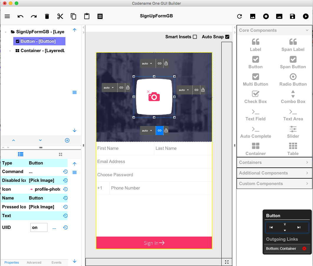
In this blog post I will be focusing on the low-level details of “how it works” so that you can understand how to best tune it to your liking. We will be producing additional demos, posts, and documentation that cover these changes from a higher-level perspective.
Background
If you’ve used Codename One at all, you’re likely aware of its heavy usage of layout managers for positioning components on the screen. You don’t just place a button on the screen at a particular size and position. You would, instead, add the button to a container and have the container’s layout manager calculate the correct position for the button. If you wanted your components to be laid out across the screen and then wrap when it runs out of room, you would use FlowLayout. If you wanted to tile your buttons in a grid, you might use GridLayout. If you want to layout the buttons vertically down the page you would use a box layout Y. Etc.. In general, it is possible to reproduce any design from a PSD file by nesting components with the classical layout managers.
Why Can’t We Just Place A Component at some (x,y) Coordinate?
Shai has written about this many times in the past. The long and short of it is that when your app is shown on a screen with different resolution or dimensions, the app may need to reposition the element. You need a layout manager that is able to dynamically calculate the appropriate position for your components based on the current state.
Unfortunately, this explanation provides little consolation to new users who just want to drag a button onto the form where they want it, and run their app. To expect new users to understand layout managers before they can build their “Hello World” app is, perhaps, a little demanding.
One key goal for this iteration of the designer was to make it more accessible to new users. I want a user to be able to drag labels, buttons, text fields, etc.. from the palette onto the form and position them freely, exactly how they like. I didn’t want them to have to worry about layout managers and the like. Just drag widgets around, and then run the app.
But Didn’t I Just Say that Absolute Positioning isn’t Practical?
Indeed absolute positioning in a mobile application is not practical. Our solution is “relative” positioning. We have beefed up the layered layout manager to support insets and inter-component references, and we have added the ability to manipulate the layout using familiar drag-and-drop GUI designer controls.
For example, if you drag a button down to the bottom corner of the form, the designer doesn’t save the absolute X,Y coordinate for the button. If saves the insets (distance) from that bottom corner. That way, at runtime, the button will always be rendered appropriately in the bottom corner no matter what the device dimensions are.
Going a step further, if you then drag a text field just to the left of the button, the designer will record the text field’s insets relative to the button so that it will lay out properly still even as the device is resized.
| The designer only automatically links the text field’s position to the button if “Smart Insets” is enabled. With “Smart Insets” disabled, you would need to link it explicitly. |
The example with only two components may seem contrived, but we have worked hard to ensure that it can scale to arbitrary UI complexity with dozens of components positioned exactly the way you want.
Under the Hood
Before we go into the designer’s UI, let’s take a moment to look at the new and improved Layered Layout manager, upon which all of this goodness rests.
Pre-3.7, LayeredLayout simply laid out containers on top of each other in layers. It didn’t allow you to position the child components, except via margins and padding.
In this release, we have kept the default behaviour the same, but have added support for constraints that add insets to child components. Here is a simple example that adds a button to the bottom, right corner of a container.
Container cnt = new Container(new LayeredLayout());
Button btn = new Button("Submit");
LayeredLayout ll = (LayeredLayout)cnt.getLayout();
cnt.add(btn);
ll.setInsets(btn, "auto 0 0 auto");
The result is:
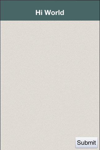
The only thing new here is this line:
ll.setInsets(btn, "auto 0 0 auto");This is called after btn has already been added to the container. It says that we want its insets to be “auto” on the top and left, and 0 on the right and bottom. This insets string follows the CSS notation of top right bottom left (i.e. start on top and go clockwise), and the values of each inset may be provided in pixels (px), millimetres (mm), percent (%), or the special “auto” value. Like CSS, you can also specify the insets using a 1, 2, or 3 values. E.g.
-
"1mm"– Sets 1mm insets on all sides. -
"1mm 2mm"– Sets 1mm insets on top and bottom; 2mm on left and right. -
"1mm 10% 2mm"– Sets 1mm on top, 10% on left and right, and 2mm on bottom. -
"1mm 2mm 1px 50%"– Sets 1mm on top, 2mm on right, 1px on bottom, and 50% on left.
auto Insets
The special “auto” inset indicates that it is a flexible inset. If all insets are set to “auto”, then the component will be centered both horizontally and vertically inside its “bounding box”.
| The “inset bounding box” is the containing box from which a component’s insets are measured. If the component’s insets are not linked to any other components, then its inset bounding box will be bounds of the component’s parent container. |
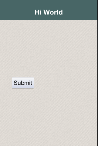
If one inset is fixed (i.e. defined in px, mm, or %), and the opposite inset is “auto”, then the “auto” inset will simply allow the component to be its preferred size. So if you want to position a component to be centered vertically, and 5mm from the left edge, you could do:
ll.setInsets(btn, "auto auto auto 5mm");Resulting in:
Move it to the right edge with:
ll.setInsets(btn, "auto 5mm auto auto");% Insets
Percent (%) insets are calculated with respect to the inset bounding box. A 50% inset is measured as 50% of the length of the bounding box on the inset’s axis. E.g. A 50% inset on top would be 50% of the height of the inset bounding box. A 50% inset on the right would be 50% of the width of the inset bounding box.
Insets, Margin, and Padding
A component’s position in a layered layout is determined as follows: (Assume that cmp is the component that we are positioning, and cnt is the container (In pseudo-code):
x = cnt.paddingLeft + cmp.calculatedInsetLeft + cmp.marginLeft
y = cnt.paddingTop + cmp.calculatedInsetTop + cmp.marginTop
w = cnt.width - cnt.verticalScroll.width - cnt.paddingRight - cmp.calculatedInsetRight - cmp.marginRight - x
h = cnt.height - cnt.horizontalScroll.height - cnt.paddingBottom - cmp.calculatedInsetBottom - cmp.marginBottom - y
The calculatedInsetXXX values here will be the same as the corresponding provided inset if the inset has no reference component. If it does have a reference component, then the calculated inset will depend on the position of the reference component.
|
If no inset is specified, then it is assumed to be 0. This ensures compatibility with designs that were created before layered layout supported insets.
Component References: Linking Components together
If all you need to do is position a component relative to its parent container’s bounds, then mere insets provide you with sufficient vocabulary to achieve this. But most UIs are more complex than this and require another concept: reference components. In many cases you will want to position a component relative to another child of the same container. This is also supported.
For example, suppose I want to place a text field in the center of the form (both horizontally and vertically), and have a button placed beside it to the right. Positioning the text field is trivial (setInset(textField, "auto")), but there is no inset that we can provide that would position the button to the right of the text field. To accomplish our goal, we need to set the text field as a reference component of the button’s left inset – so that the button’s left inset is “linked” to the text field. Here is the syntax:
Container cnt = new Container(new LayeredLayout());
LayeredLayout ll = (LayeredLayout)cnt.getLayout();
Button btn = new Button("Submit");
TextField tf = new TextField();
cnt.add(tf).add(btn);
ll.setInsets(tf, "auto")
  .setInsets(btn, "auto auto auto 0")
  .setReferenceComponentLeft(btn, tf, 1f);
This would result in:
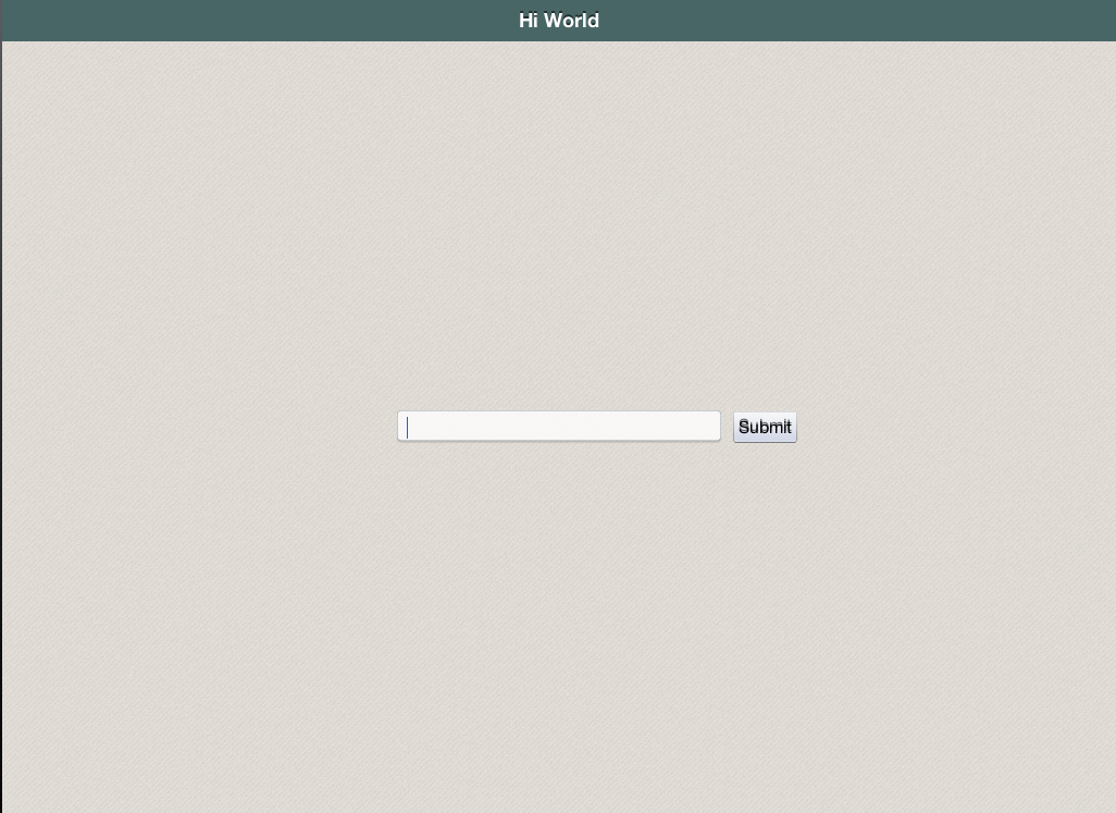
The two active lines here are the last two:
  .setInsets(btn, "auto auto auto 0") (1)
.setReferenceComponentLeft(btn, tf, 1f); (2)| 1 | Sets the left inset on btn to 0. |
| 2 | Links btn’s left inset to `tf so that it is measured from the text field. The third parameter (1.0) is the reference position. This will generally either be 0 (meaning the reference point is the left edge of the text field), or 1 (meaning the reference point is the right edge of the text field). In this case we set a reference position of 1.0 because we want the button to be aligned to the text field’s right edge. |
| The reference position is defined as the distance, expressed as a fraction of the reference component’s length on the inset’s axis, between the reference component’s leading (outer) edge and the point from which the inset is measured. A reference position of 0 means that the inset is measured from the leading edge of the reference component. A value of 1.0 means that the inset is measured from the trailing edge of the reference component. A value of 0.5 means that the inset is measured from the center of the reference component. Etc… Any floating point value can be used. The designer currently only makes use of 0 and 1. |
The definition above may make reference components and reference position seem more complex than it is. Some examples:
-
For a top inset:
-
referencePosition == 0 ⇒ the inset is measured from the top edge of the reference component.
-
referencePosition == 1 ⇒ the inset is measured from the bottom edge of the reference component.
-
-
For a bottom inset:
-
referencePosition == 0 ⇒ the inset is measured from the bottom edge of the reference component.
-
referencePosition == 1 ⇒ the inset is measured from the top edge of the reference component.
-
-
For a left inset:
-
referencePosition == 0 ⇒ the inset is measured from the left edge of the reference component.
-
referencePosition == 1 ⇒ the inset is measured from the right edge of the reference component.
-
-
For a right inset:
-
referencePosition == 0 ⇒ the inset is measured from the right edge of the reference component.
-
referencePosition == 1 ⇒ the inset is measured from the left edge of the reference component.
-
The New Designer
Now that you understand the basics of insets and reference components, let’s delve into the UI that we’ve designed to leverage this layout. The new GUI Builder includes a new designer that makes it a breeze to layout UIs. It allows you to drag components from the component palette onto the canvas just as you did before. The difference is that now you can move and resize your components exactly as you see fit. You aren’t constrained to the positions dictated by the form’s layout manager.
As an example, let’s drag a button onto a blank form and see what happens. The button will be “selected” initially after adding, it so you’ll see its outline, and resize handles for adjusting its size and position. You’ll also see four floating labels (above, below, to the left, and to the right) that show the corresponding side’s inset values and allow you to adjust them.
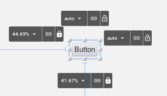
Press the mouse inside the bounds of the button and drag it around to reposition it. You will notice that the inset labels change to reflect the new inset values. If you drag the button close to the edge of the form, the corresponding inset value will change to millimetres. If you move farther away from the edge, it will change to percentage values.
The Inset Control
Let’s take a closer look at the inset control (the inset controls are the black buttons that appear to the top, bottom, left, and right of the selected component).

Each control has three sections:
-
The inset value drop-down menu. This shows the current value of the inset (e.g. 0mm, 25%, auto, etc…). If you click on this, it will open a menu that will allow you to change the units. If the inset is currently in millimetres, it will have options for pixels, and percent. If the inset is in percent, it will have options for pixels and millimetres. Etc.. It also includes a text field to enter a an inset value explicitly.

-
The “Link” Button
 – If the inset is linked to a reference component, then this button will be highlighted “blue”, and hovering over it will highlight the reference component in the UI so that you can clearly see which component it is linked to. Clicking on this button will open a dialog that will allow you to “break” this link. You can drag this button over any component in the form to “link”.
 -
The “Lock” Button”
 – This button allows you to toggle the inset between “flexible” (i.e. auto) and “fixed” (i.e. millimetres or percent).
Auto Snap
Notice the “auto-snap” checkbox that appears in the top-right corner of the designer.

Auto-snap does exactly what it sounds like: It automatically snaps two components together when you drag them near each other. This is handy for linking components together without having to explicitly link them (using the “link” button). This feature is turned on by default. If auto-snap is turned off, you can still initiate a “snap” by holding down the ALT/Option key on your keyboard during the drag.
Smart Insets
Beside the “auto-snap” checkbox is another checkbox named “Smart Insets”.

Smart Insets is an experimental feature at this point. It uses some heuristics during a drag to try to determine how the insets should be linked. Currently the heuristics are quite basic (it tries to link to the nearest neighbour component in most cases), but we will be working on improving this for future releases. This feature is turned off by default while it is still being refined. The goal is to improve this to the point where it always makes the correct link choices – at which time you will be able to use the designer without having any knowledge of insets or reference components. It will just work. In the current version, I generally work with auto-snap “on”, and explicitly assign links myself using the “link” button. This gives me full control of my UI and how it will be resized. Once you get used to insets and how the links work, it becomes quite easy.
The Widget Control Pad
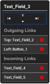
When a component is selected, you should see a black floating panel appear in the lower right of the screen.
This is the widget control pad, and it provides an alternative view of the component’s links. It also provides a useful list of incoming links (i.e. components that “depend on” this component’s positioning). In some cases, you may want to disconnect incoming links so that you can drag the component without affecting the position of dependent components.
This control pad also includes game-pad-like controls (up, down, left, right), that allow you to “tab” the component to the next guide in that direction. Tab positions exist at component edges in the form. This is useful for aligning components with each other.
Keyboard Short-Cuts
-
Arrow Keys – Use the up/down/left/right arrow keys to nudge the currently selected component a little bit at a time. This is a convenient way to move the component to a position that is more precise than can easily be achieved with a mouse drag.
-
Arrow Keys + SHIFT – Hold down the SHIFT key while pressing an arrow key and it will “tab” the component to the next tab marker. The form has implicit tab markers at the edge of each component on the form.
-
ALT/Option Key + Click or Drag – Holding down the option/alt key while clicking or dragging a component will resulting in “snapping” behaviour even if auto-snap is turned off.
Sub-Containers
In some cases, you may need to add sub-containers to your form to aid in grouping your components together. You can drag a container onto your form using the “Container” palette item (under “Core Components”). The default layout the subcontainer will be LayeredLayout so that you are able to position components within the sub-container with precision, just like on the root container.
You can also change the layout of subcontainers to another classical layout manager (e.g. grid layout, box layout, etc..) and drag components directly into it just as you did with the old designer. This is very useful if parts of your form lend themselves. As an example, let’s drag a container onto the canvas that uses BoxLayout Y. (You can find this under the “Containers” section of the component palette).
Drag the button (that was previously on the form) over that container, and you should see a drop-zone become highlighted.
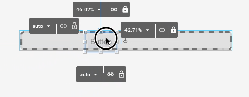
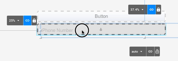
You can drop the button directly there. You can As you drag more components into the sub-container, you’ll see them automatically laid out vertically.
The Canvas Resize Tool
When designing a UI with the new designer it is very important that you periodically test the form’s “resizing” behaviour so that you know how it will behave on different devices. Components may appear to be positioned correctly when the canvas is one size, but become out of whack when the container is resized. After nearly every manipulation you perform, it is good practice to drag the canvas resize tool (the button in the lower right corner of the designer) smaller and bigger so you can see how the positions are changed. If things grow out of whack, you may need to toggle an inset between fixed and auto, or add a link between some of the components so that the resizing behaviour matches your expectations.
The Future
This GUI builder release represents the first step in a new direction. We have our own internal todo list for moving the GUI builder forward – things like improvements to Smart Insets, better styles integration, support for more component types, and better UI tools for manipulating component properties. But we’d like to hear your feedback. What are your pain points? What do you want to do with the GUI builder that you currently find difficult? Please let us know in the comments.



10 Comments
I haven’t used this, so the answer might be obvious – when you use the new GUI builder, does this create a “GUI only” app ?
The GUI project is an old concept that was retired.
The new GUI builder uses one form per GUI form. This means it works with regular Codename One projects and without the state machine.
Very nice.
I would like to bring to your attention another tool that you might consider while you are improving your UI design tool as well. It is called Livecode (LC). In LC, you dont have to worry at all about positioning your UI with different screen resolutions and only one line of code makes all your UIs fit all screens. I wish CN1 has a similar ability since it is far more advanced that LC when it comes to technology integration.
Their tool is more about natural language not layout. It works with templates not components so it doesn’t allow you to do anything you want for any resolution or form factor (e.g. tablets). We would like to have more ready made templates that would effectively reduce the amount of UI you need to create.
Also features like properties and the automatic UI generation API can go a long way here where you don’t need to write any UI code.
Took the new GUI builder for a test run today and looks very promising, guys! Still some bugs to sort out (eg. the Tabs component was difficult to work with) but I’m sure you’re working on it. I can definitely see a business case for me signing up to CodeName one if the GUI builder reaches a point where I can quickly and reliably develop high quality front-ends for mobile devices.
looking forward to future updates!
Thanks!
The tabs should be improved/fixed by now, we specifically didn’t commit that to keep the release stable. As I mentioned here: [https://www.codenameone.com…](https://www.codenameone.com/blog/survey-results-kotlin-updates-news.html)
We’ll include that fix in the 3.7.2 update that will come our on Friday.
Hi Shai,
Thought I’d let you know I just downloaded the 3.7.2 pluggin for NetBeans and the GUI builder still doesn’t handle Tabs properly… there’s just nothing showing up in the navigation pane when components are added to a Tabs container. I was able to define tab text and icons but couldn’t go any further.
Thanks. Can you please file an issue on that?
It probably didn’t make it eventually, I recall seeing it on an internal list but it must have gotten buried.
Hello. There should be a tool to convert the style of the old GUI builder with the new GUI. Error free and smooth.
Hi,
tools become error free when people report errors in the issue tracker and we fix them: [http://github.com/codenameo…](http://github.com/codenameone/CodenameOne/issues/)
The converter is old so most people didn’t use it and just chose to start from scratch hence its still buggy. It’s probably not worth our time fixing a feature that people don’t report issues on.
Regardless the converter was written for the original incarnation of the new GUI builder. The new GUI builder now includes the autolayout mode which is FAR superior to the previous approach. Since it’s so different conceptually from the old layout based approach there is no way to make it compatible or smooth. The converter will translate to the old approach which doesn’t give a huge advantage.
I think our resources are better spent fixing issues in the devices/simulator. Improving the default UX and addressing issues people report in the issue tracker. Having said that if you run into an issue and report it in the issue tracker we’ll fix it.