
The Tabs component isn’t our first attempt at the the multi-tab UI and as such we made a lot of changes to the logic to facilitate a level of flexibility that can answer most use cases e.g. Tabs that can be closed with an X on the top right section or span multiple rows.
Most developers are oblivious to this capability which is a shame, it is indeed a bit obscure. The code below demonstrates multi-line tabs:
Form hi = new Form("Custom Tabs", new BorderLayout());

Tabs tb = new Tabs() {
    @Override
    protected Component createTab(String title, Image icon) { (1)
        SpanButton custom = new SpanButton(title);
        custom.setIcon(icon);
        custom.setUIID("Container");
        custom.setTextUIID("Tab");
        custom.setIconPosition(BorderLayout.NORTH);
        custom.setIconUIID("Tab");
        return custom;
    }

    @Override
    protected void setTabSelectedIcon(Component tab, Image icon) {
        ((SpanButton)tab).setPressedIcon(icon); (2)
    }

    protected void selectTab(Component tab) { (3)
    }

    @Override
    protected void bindTabActionListener(Component tab, ActionListener l) {
        ((SpanButton)tab).addActionListener(l);
    }
};

tb.setTabUIID(null);
tb.addTab("Tab 1", FontImage.MATERIAL_3D_ROTATION, 4, new Label("T1"));
tb.addTab("Really long text in tab", FontImage.MATERIAL_ACCESSIBILITY, 4, new Label("T2"));
tb.addTab("Tab 3", FontImage.MATERIAL_ACCESS_ALARM, 4, new Label("T3"));
tb.addTab("Tab 4", FontImage.MATERIAL_ACCOUNT_BOX, 4, new Label("T4"));

tb.getTabsContainer().setScrollableX(false); (4)

hi.add(BorderLayout.CENTER, tb);

hi.show();| 1 | This method can return any arbitrary component to use as a Tab, by default Tabs uses RadioButton but you can use anything e.g. here we used SpanButton |
| 2 | We added this in the latest version in git, that method still isn’t available but will be this Friday |
| 3 | This method works well when we have a RadioButton tab at which point it can make it “selected” however in this case I would just set the UIID to something other than the default for the selected tab. Since I didn’t want to get into it I left it blank. |
| 4 | By default tabs are scrollable which prevents them from breaking lines. This code must reside after adding the tabs otherwise scrollability will be enabled implicitly. |
The result looks pretty much like a standard tabs only it allows line breaks and when we have enough space uses it intelligently.
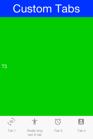
Figure 1. Portrait mode shows the line break in place
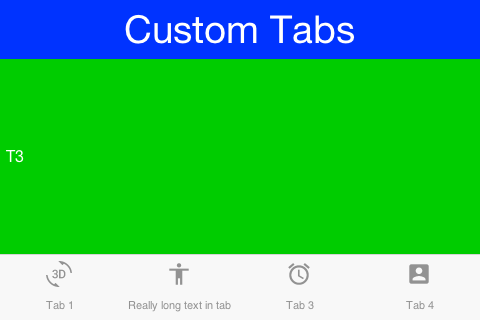
Figure 2. In landscape we have more space so a line break isn’t necessary

2 Comments
How can I add form instead a container to the taps for better scalability code?
Adding forms into a Container is a bad practice. A form is huge and heavyweight. You should do the reverse and add a container into a form and tab.